Layout


Custom Layouts
Read [[1,1], [1]] as:
Row 1: two equal sized images each taking up half of the column
Row 2: one image, taking up the entire column
::: {layout="[[1,1], [1]]"}

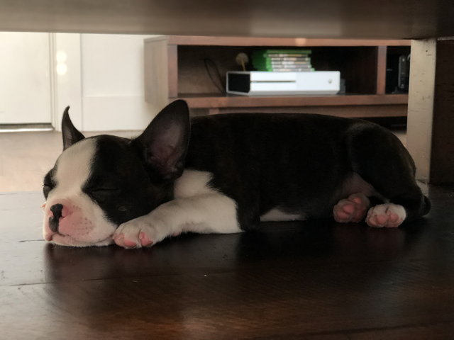

:::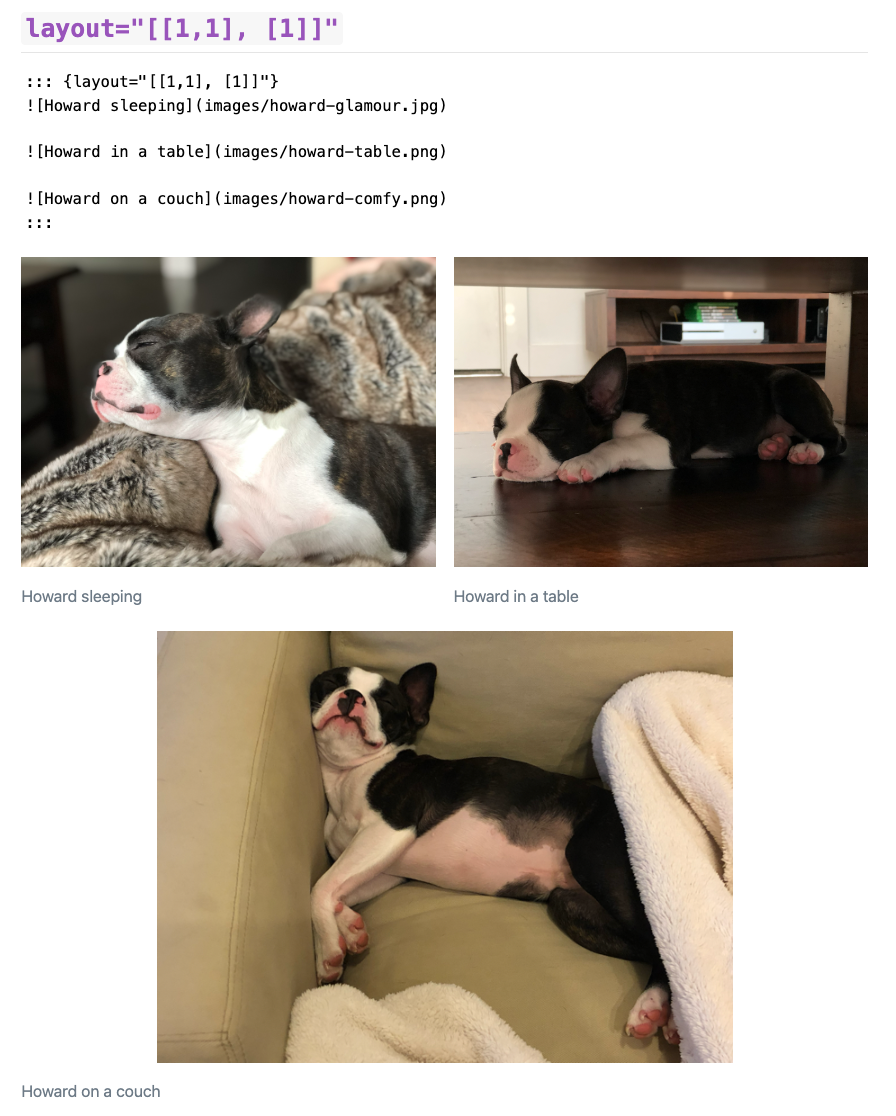
Custom Layouts
Read "[[70,30], [100]]" as:
Row 1: two images, taking up 70% and 30% of the column
Row 2: one image, taking up 100% of column
::: {layout="[[70,30], [100]]"}


:::
Custom layouts
You can also add negative values for “blank space”
[[40,-20,40], [100]]
Row 1: 40% image 1, 20% blank, 40% image 2
Row 2: 100% image 3
::: {layout="[[40,-20,40], [100]]"}


:::![]()
Custom layouts, vertical
If images within a row are of differing heights, you can control vertical alignment.
{layout="[25,-2,10]" layout-valign="bottom"}
Row: 25
::: {layout="[25,-2,10]" layout-valign="bottom"}


:::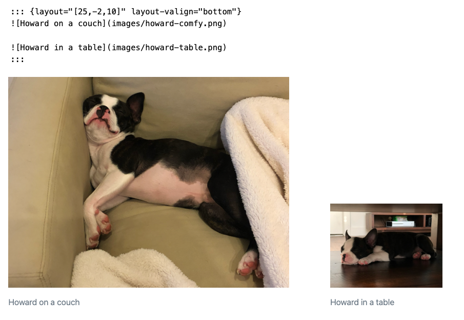
Figure layout
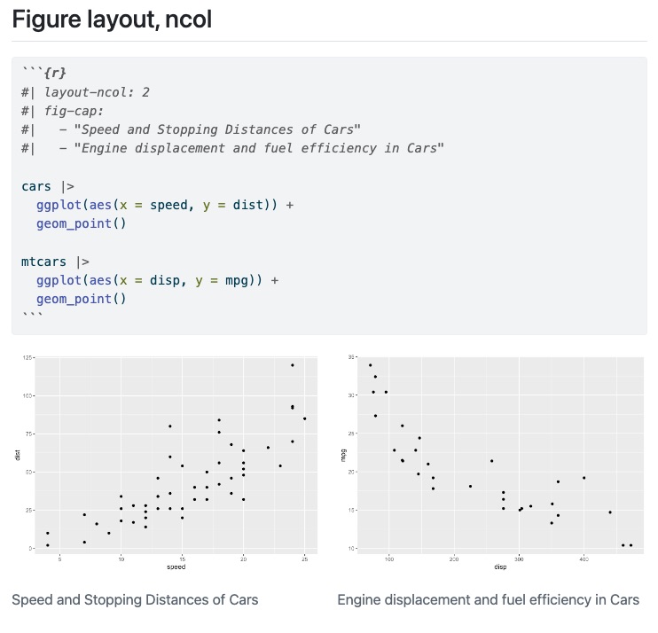
Figure layout, subcaptions
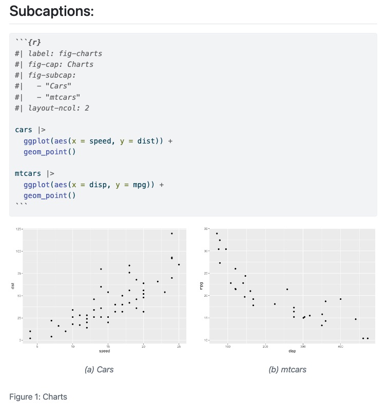
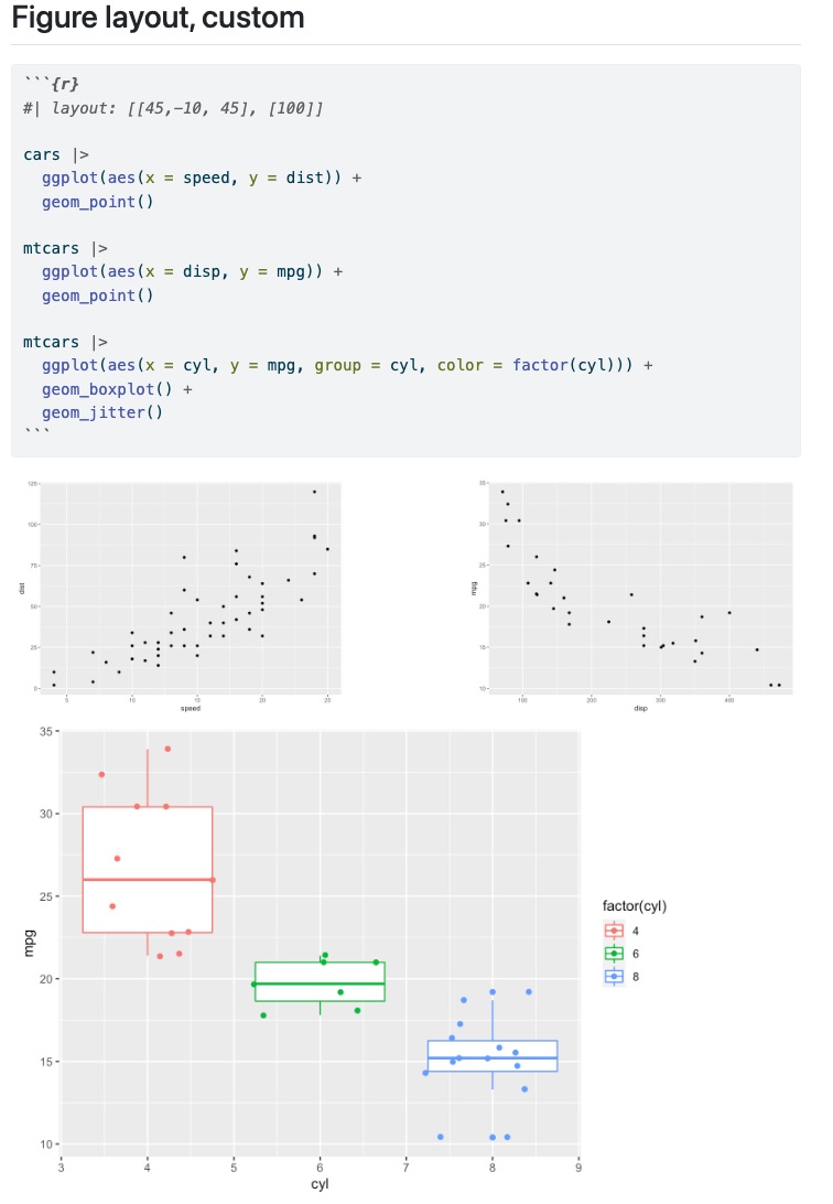
Figure layout, custom
Grid, custom layout
The “grid” layout in Quarto is 12 units wide - you can break up the grid into different subsections as long as they add up to 12.
This column takes 1/3 of the page
This column takes 2/3 of the page 
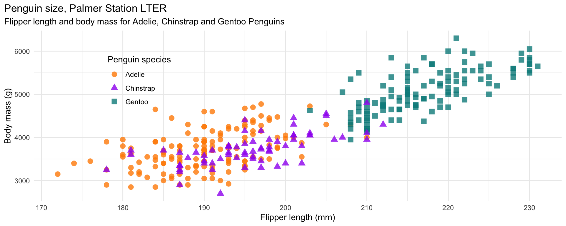
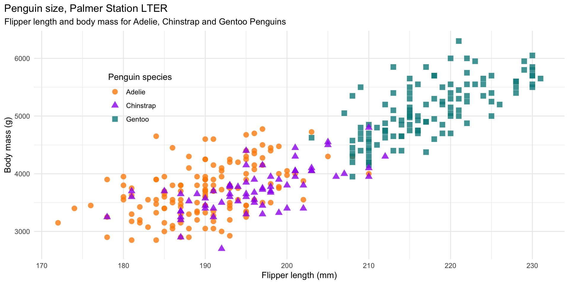
ggplot2

ggplot2
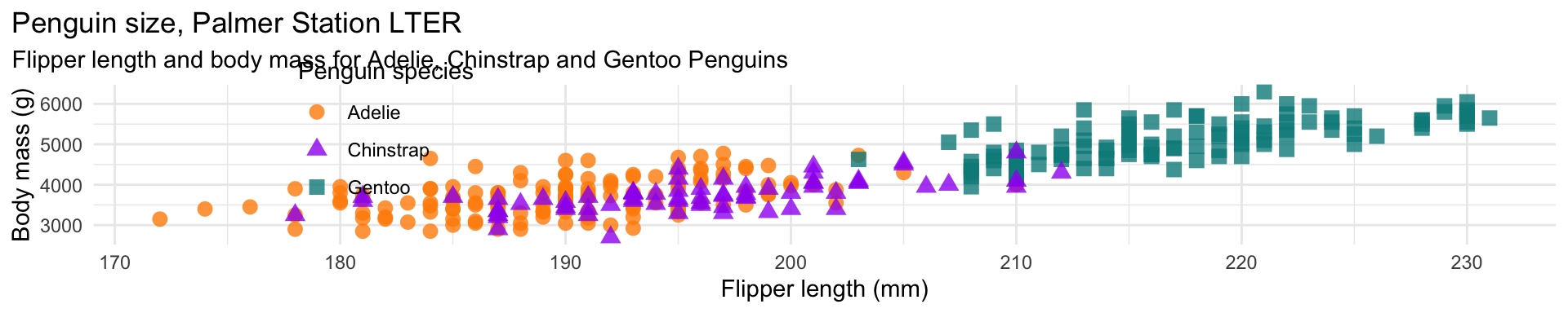
ggplot2
ggplot2
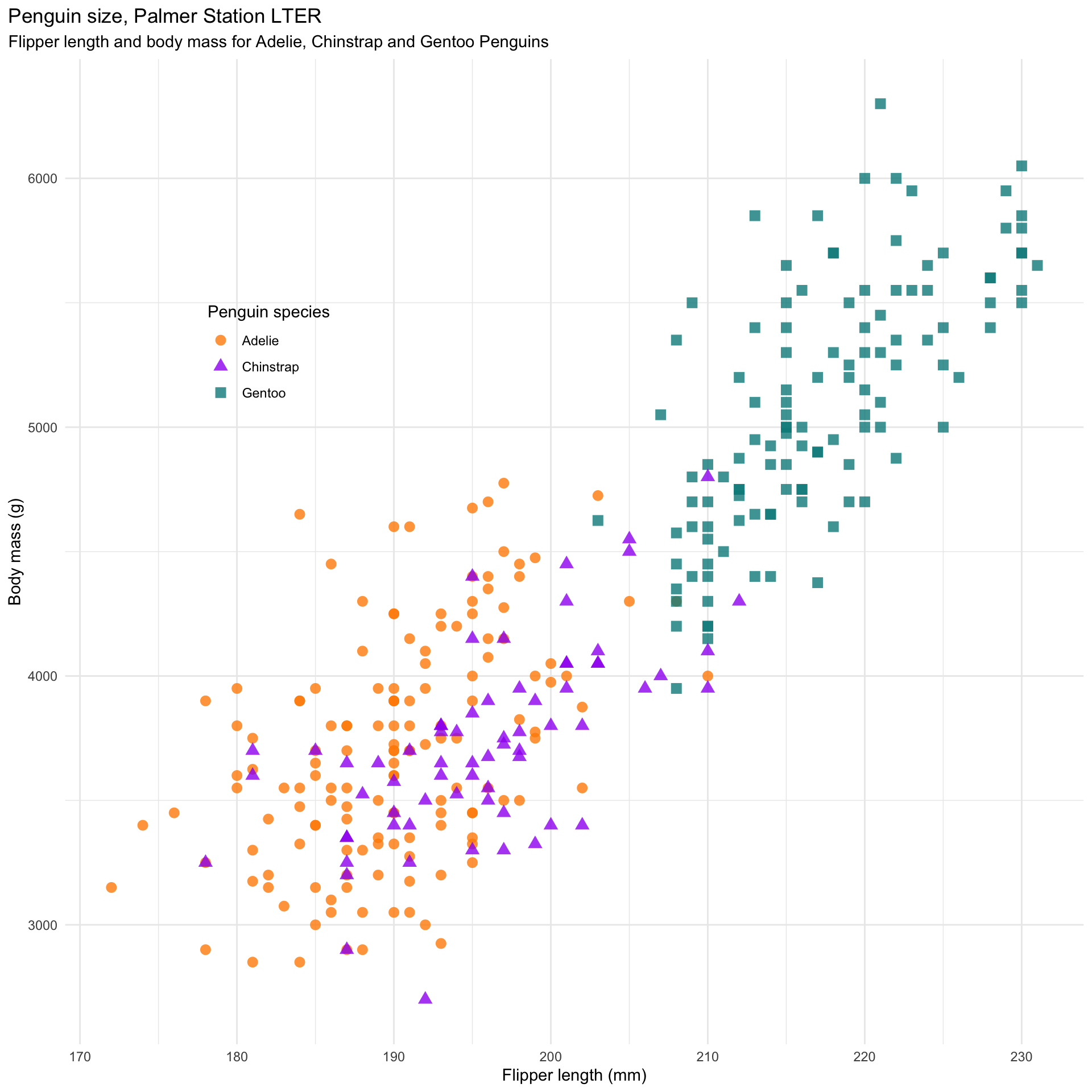
ggplot2

ggplot2
gt + gtExtras
With the gt package, anyone can make wonderful-looking tables using the R programming language. The gt philosophy: we can construct a wide variety of useful tables with a cohesive set of table parts. These include the table header, the stub, the column labels and spanner column labels, the table body, and the table footer.

gt, a Grammar of Tables

gt extension packages
gtExtras
![]()
gtExtrasprovides additional helper functions togt, mainly themes and inline plotting
gtsummary
![]()
gtsummaryextendsgtto descriptive statistics and statistical summaries of models
gtExtras

Your Turn
- Open
materials/workshop/07-static/gt-summary.qmd - Open
materials/workshop/07-static/stat-html.qmd - Explore and render