Graphic Design with ggplot2
How to Create Engaging and
Complex Visualizations in R
{ggplot2} is a system for declaratively creating graphics,
based on “The Grammar of Graphics” (Wilkinson, 2005).
You provide the data, tell {ggplot2} how to map variables to aesthetics,
what graphical primitives to use, and it takes care of the details.

Illustration by Allison Horst
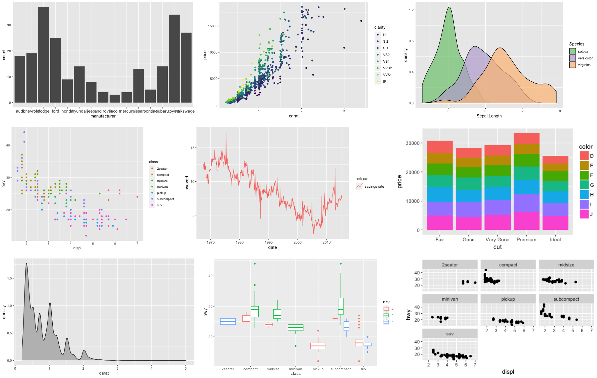
ggplot2 Examples featured on ggplot2.tidyverse.org
Illustration by Allison Horst
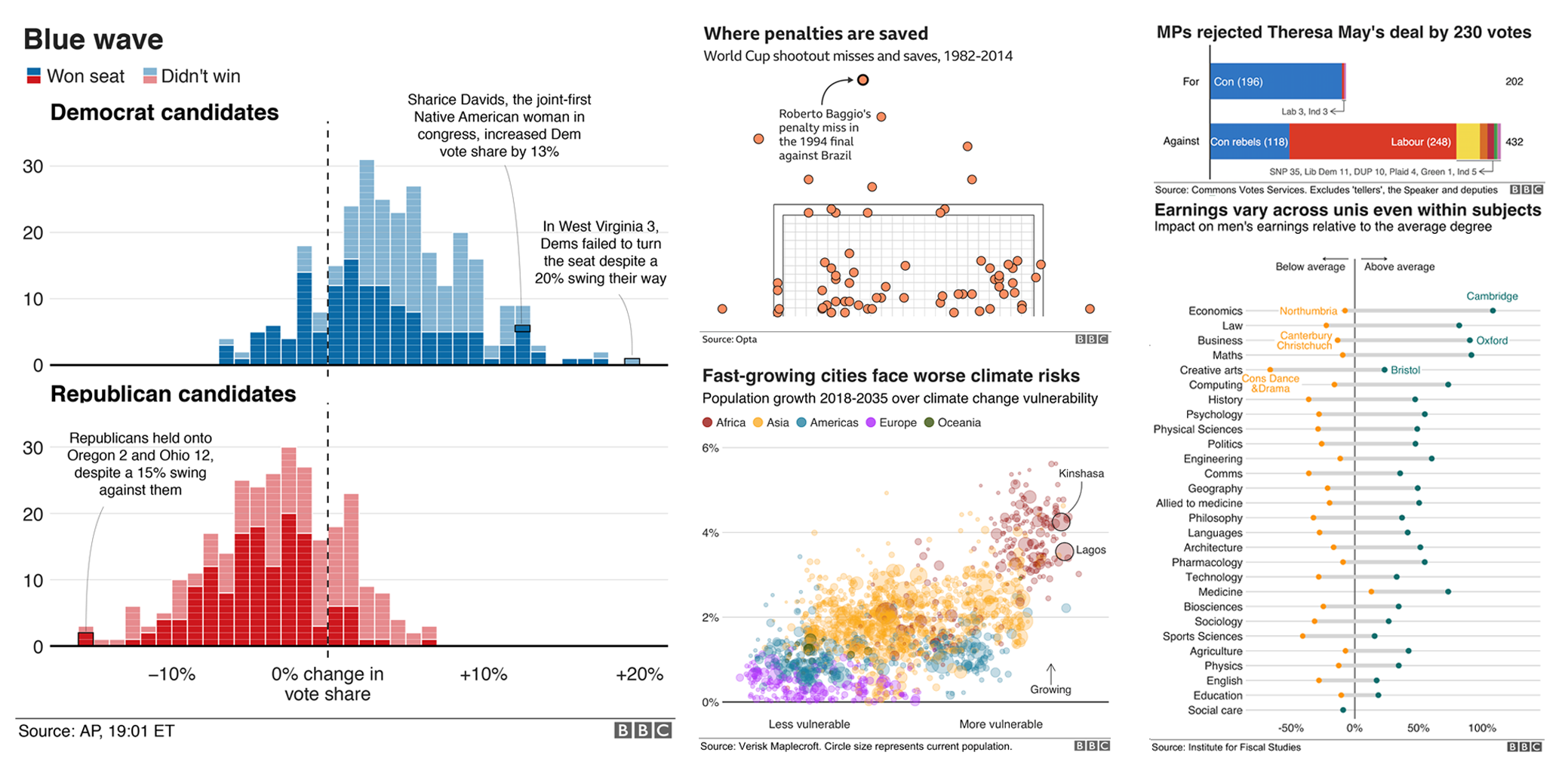
Collection of Graphics from the BBC R Cookbook
Contribution to #TidyTuesday Week 2020/31
My reinterpreted The Economist graphic
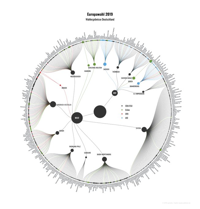
“European Elections” by Torsten Sprenger
Contribution to #TidyTuesday Week 2020/08
Contribution to the #SWDchallenge “Small Multiples”
Contribution to the #TidyTuesday Week 2021/15 x #30DayChartChallenge 2021 by Jake Kaupp
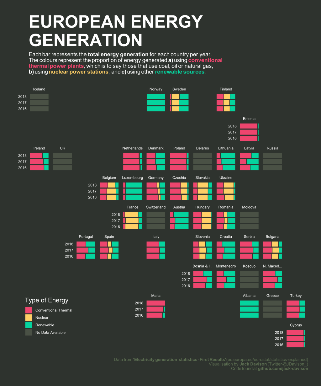
Moon Charts as a Tile Grid Map showing the 2nd Vote Results from the German Election 2021
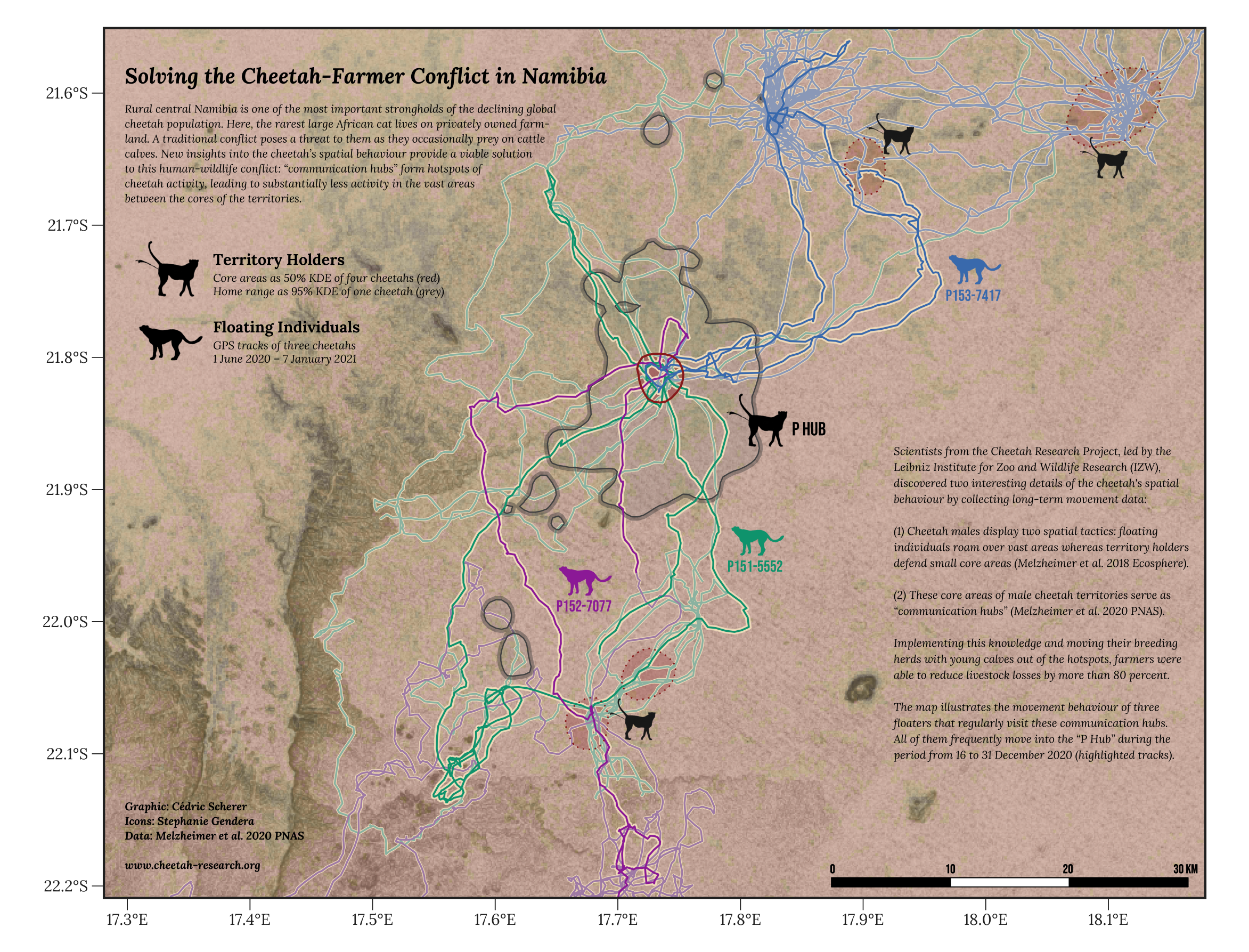
Our Winning Contribution to the BES MoveMap Contest
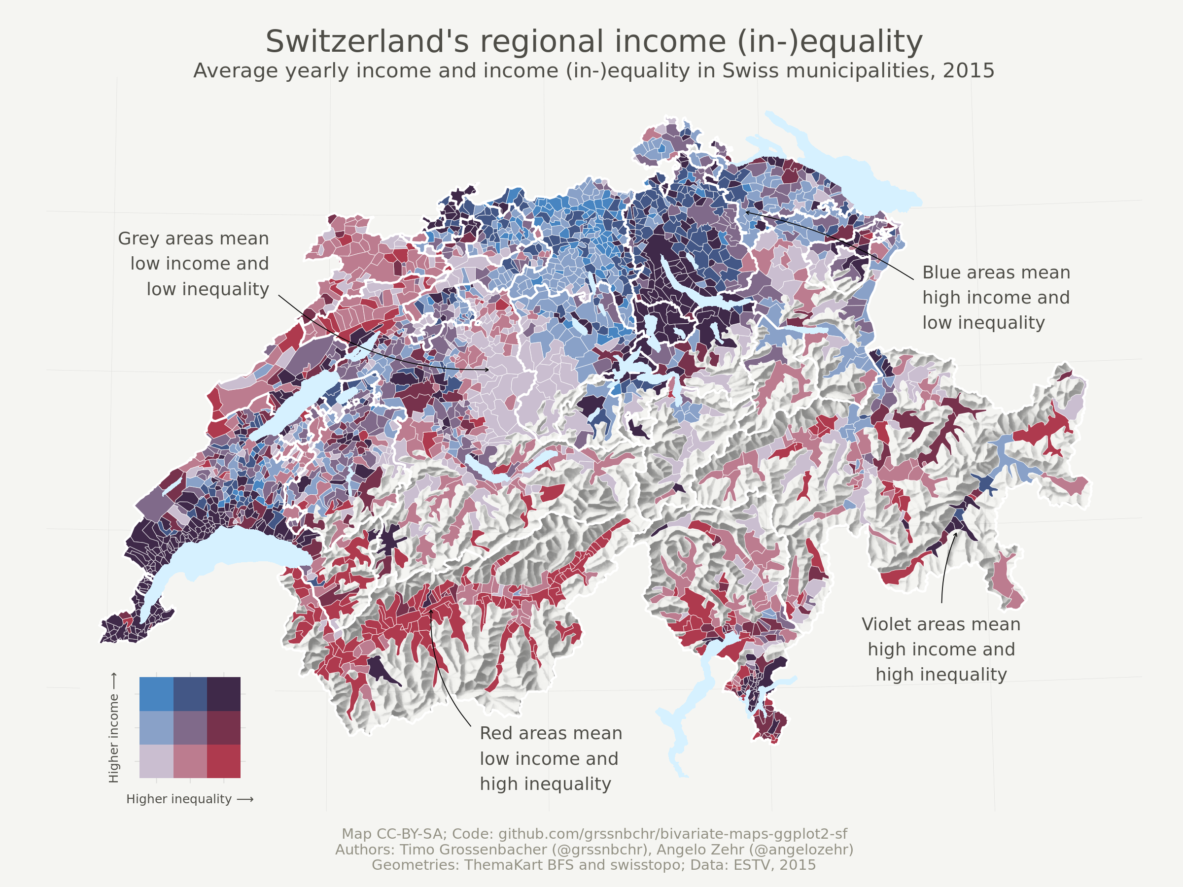
Bivariate Choropleth x Hillshade Map by Timo Gossenbacher
Pixel Art by Georgios Karamanis

Generative Art by Thomas Lin Pedersen
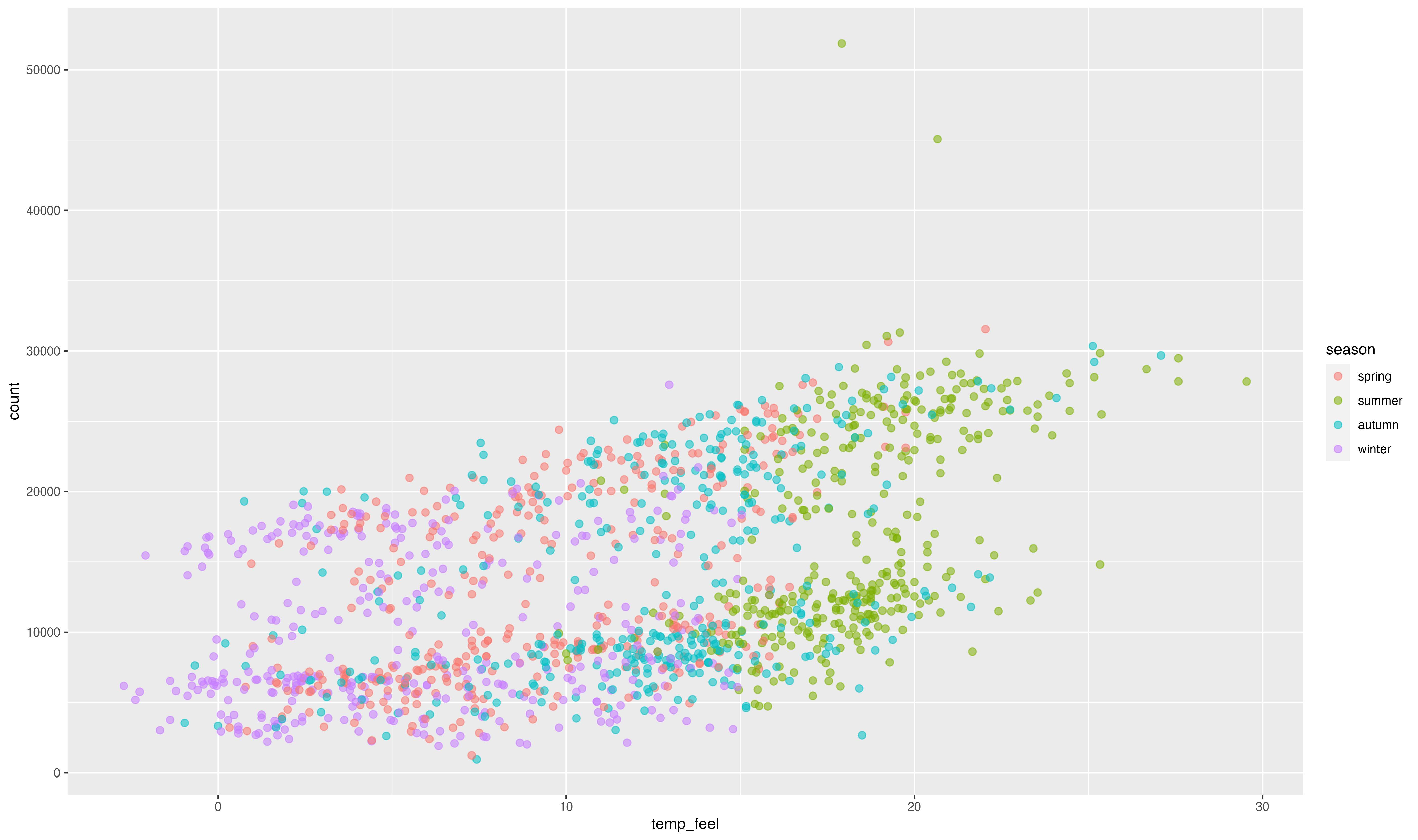

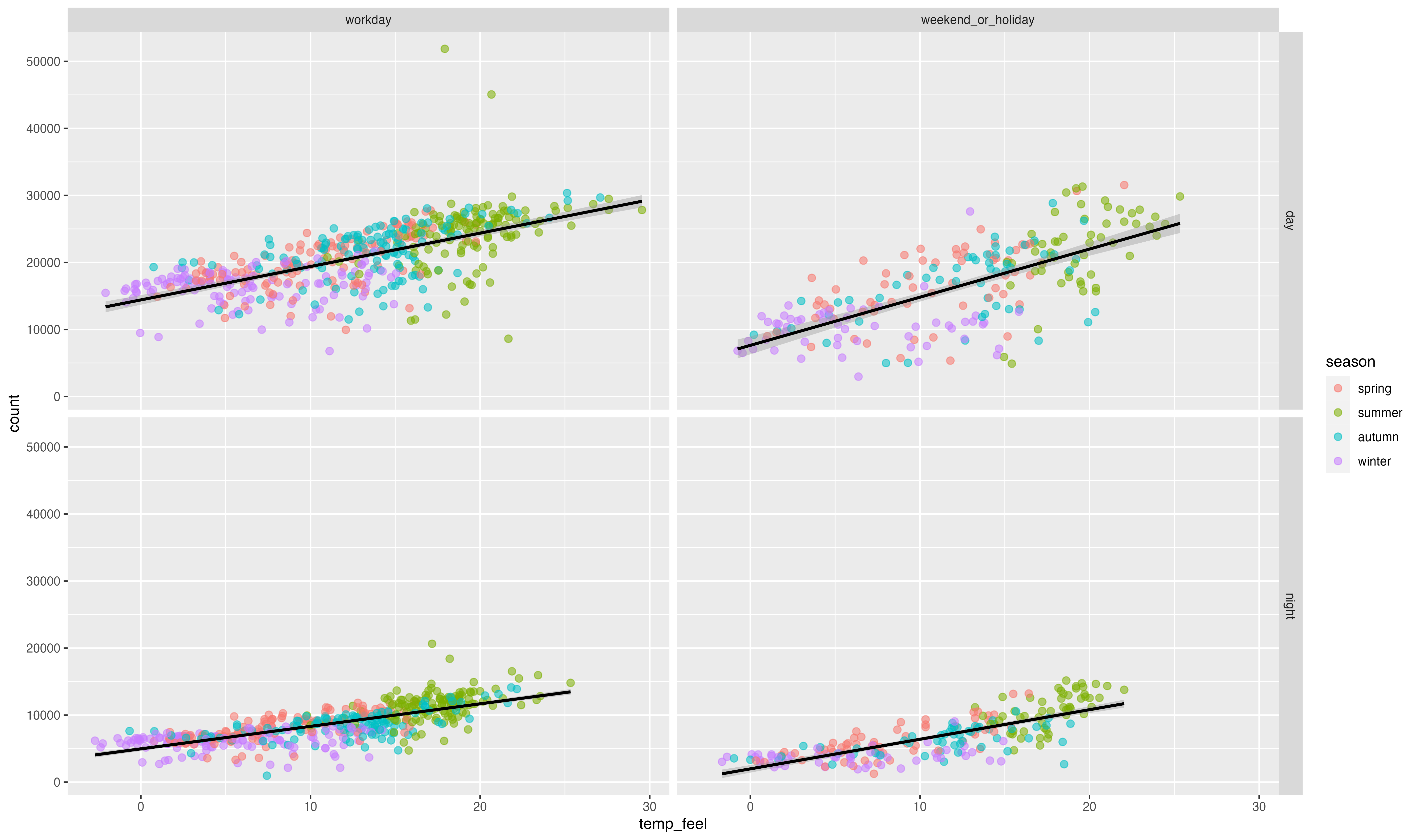
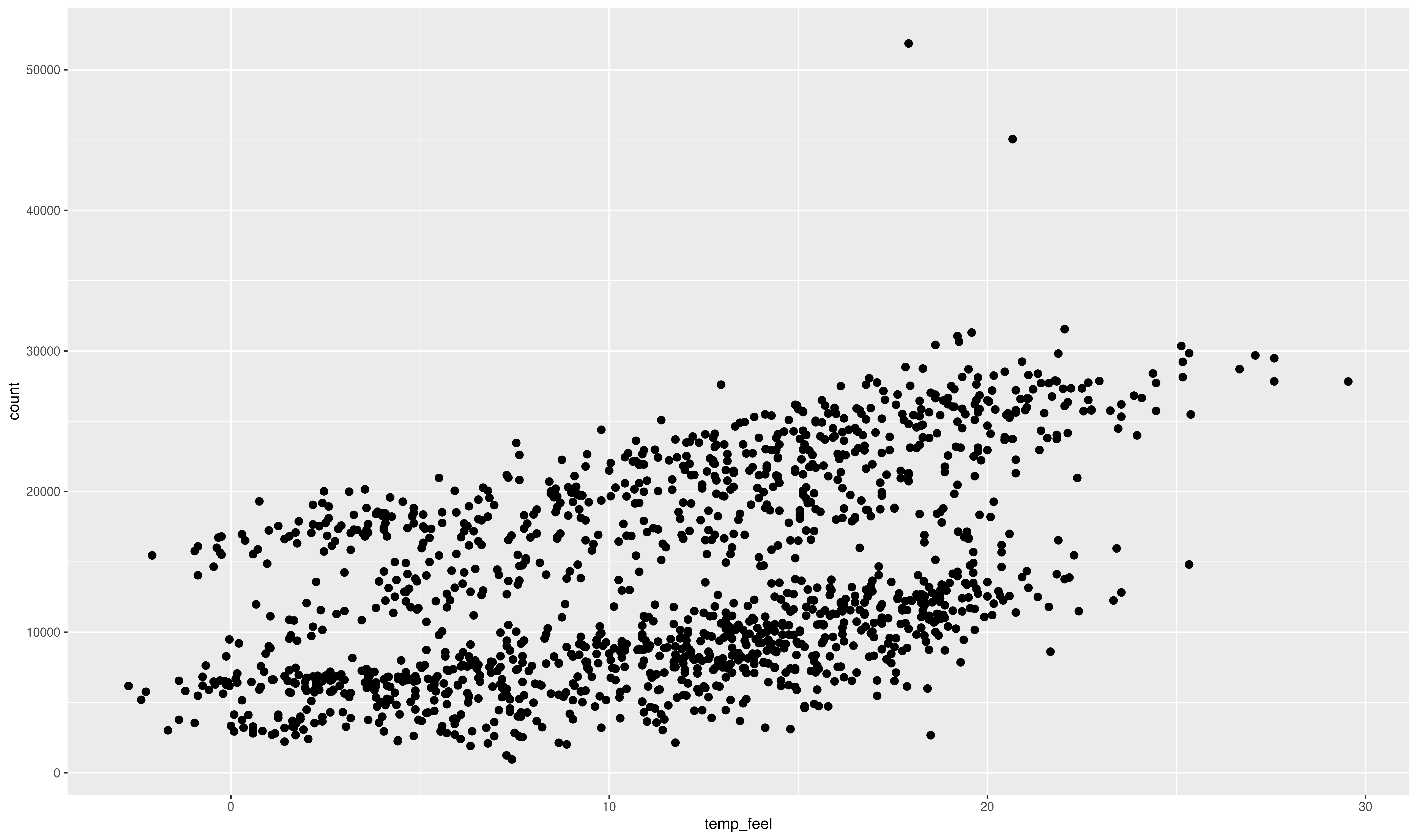
ggplot(bikes, aes(temp_feel, count)) +
  geom_point(
    aes(color = season),
    size = 2.2, alpha = .55
  ) +
  geom_smooth(
    aes(group = day_night),
    method = "lm", color = "black"
  ) +
  ## create free-ranging, proportionally sized small multiples
  facet_grid(
    day_night ~ is_workday,
    scales = "free_y", space = "free_y"
  )
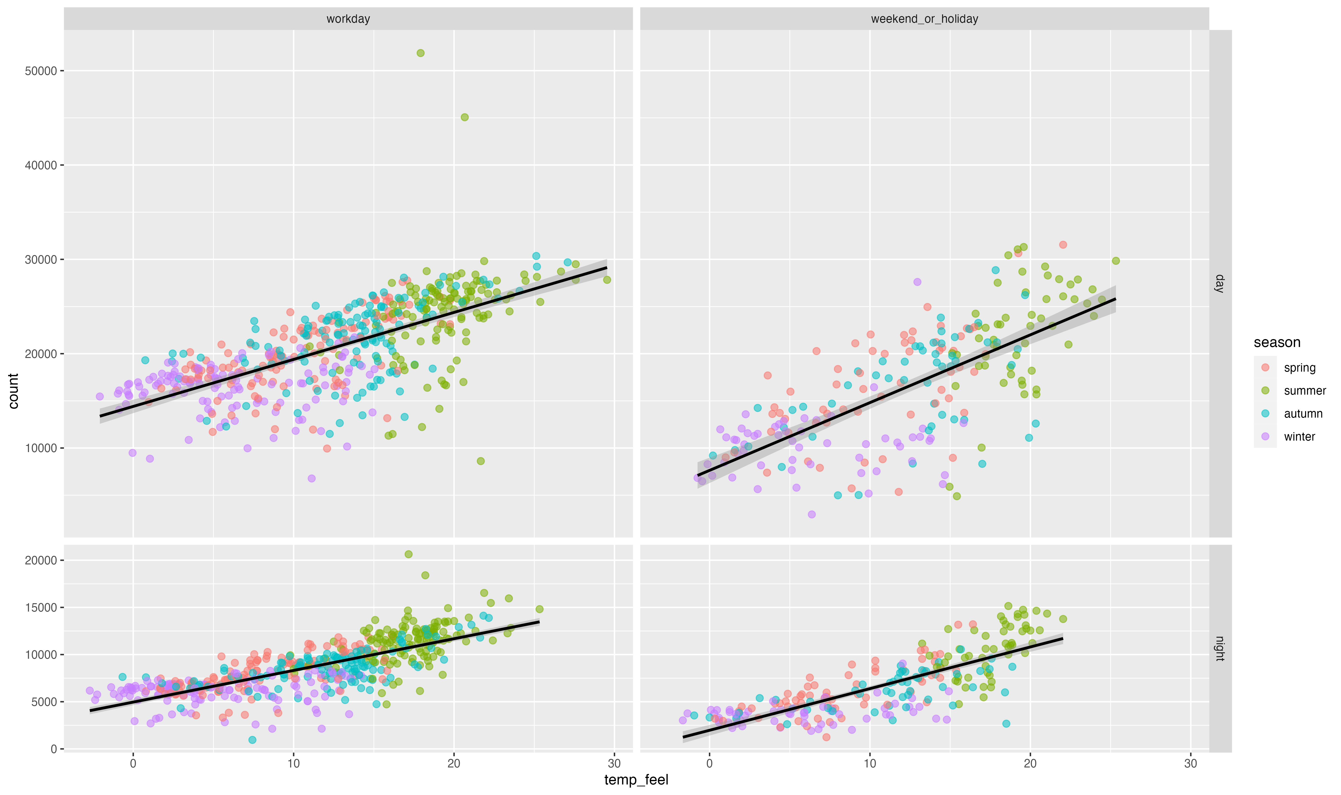
ggplot(bikes, aes(temp_feel, count)) +
  geom_point(
    aes(color = season),
    size = 2.2, alpha = .55
  ) +
  geom_smooth(
    aes(group = day_night),
    method = "lm", color = "black"
  ) +
  facet_grid(
    day_night ~ is_workday,
    scales = "free_y", space = "free_y"
  ) +
  ## add labels + titles
  labs(
    x = "Feels-Like Temperature", y = NULL,
    caption = "Data: TfL (Transport for London), Jan 2015 — Dec 2016",
    title = "Reported bike rents versus feels-like temperature in London per time of day, period, and season."
  )
ggplot(bikes, aes(temp_feel, count)) +
  geom_point(
    aes(color = season),
    size = 2.2, alpha = .55
  ) +
  geom_smooth(
    aes(group = day_night),
    method = "lm", color = "black"
  ) +
  facet_grid(
    day_night ~ is_workday,
    scales = "free_y", space = "free_y"
  ) +
  ## add custom colors + legend styling
  scale_color_manual(
    values = c("#3c89d9", "#1ec99b", "#F7B01B", "#a26e7c"), name = "Season:",
    guide = guide_legend(override.aes = list(size = 5))
  ) +
  labs(
    x = "Feels-Like Temperature", y = NULL,
    caption = "Data: TfL (Transport for London), Jan 2015 — Dec 2016",
    title = "Reported bike rents versus feels-like temperature in London per time of day, period, and season."
  ) +
  ## use different theme and typeface
  theme_light(base_size = 18, base_family = "Cabinet Grotesk")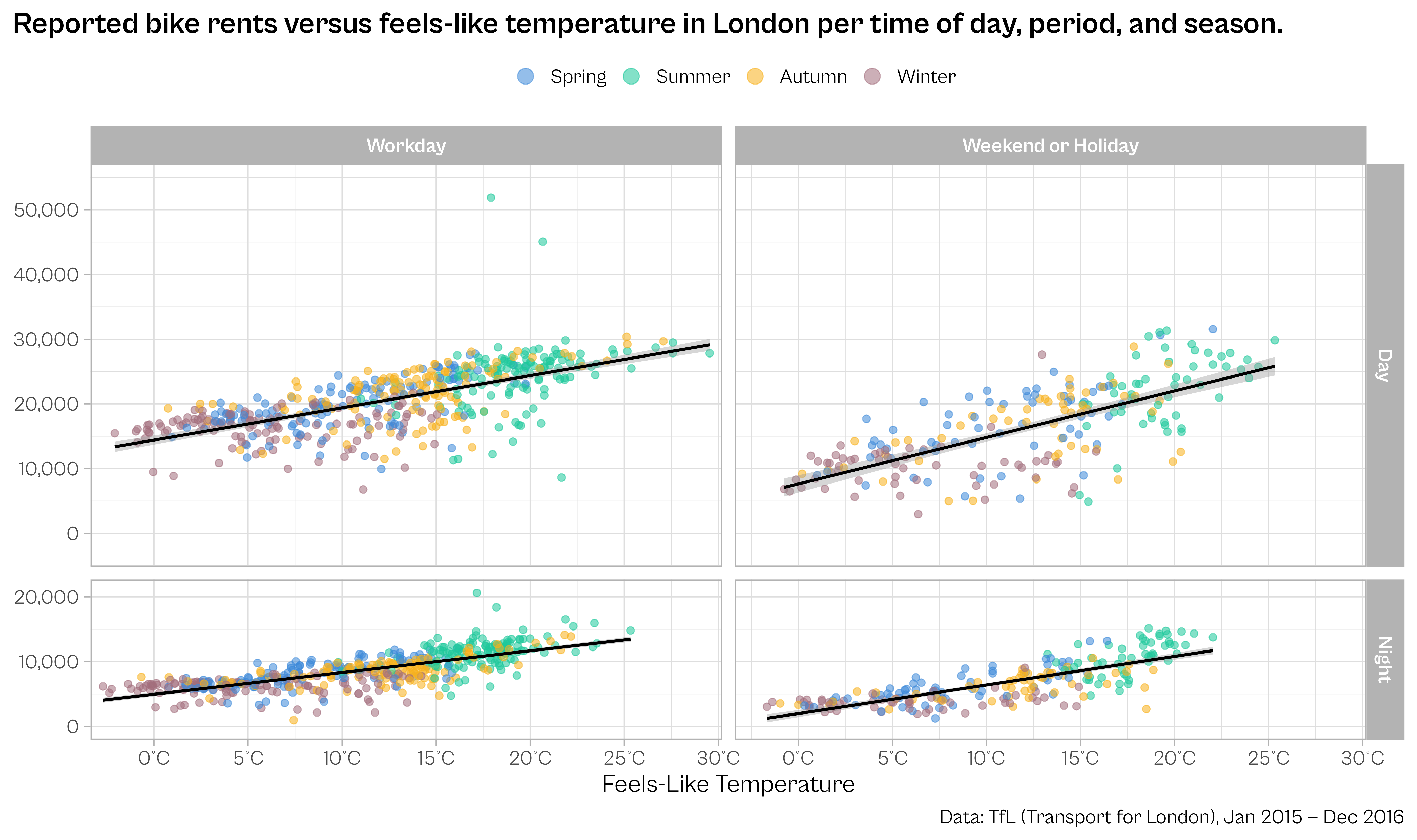
## coding for facet strip text
codes <- c(
workday = "Workday",
weekend_or_holiday = "Weekend or Holiday"
)
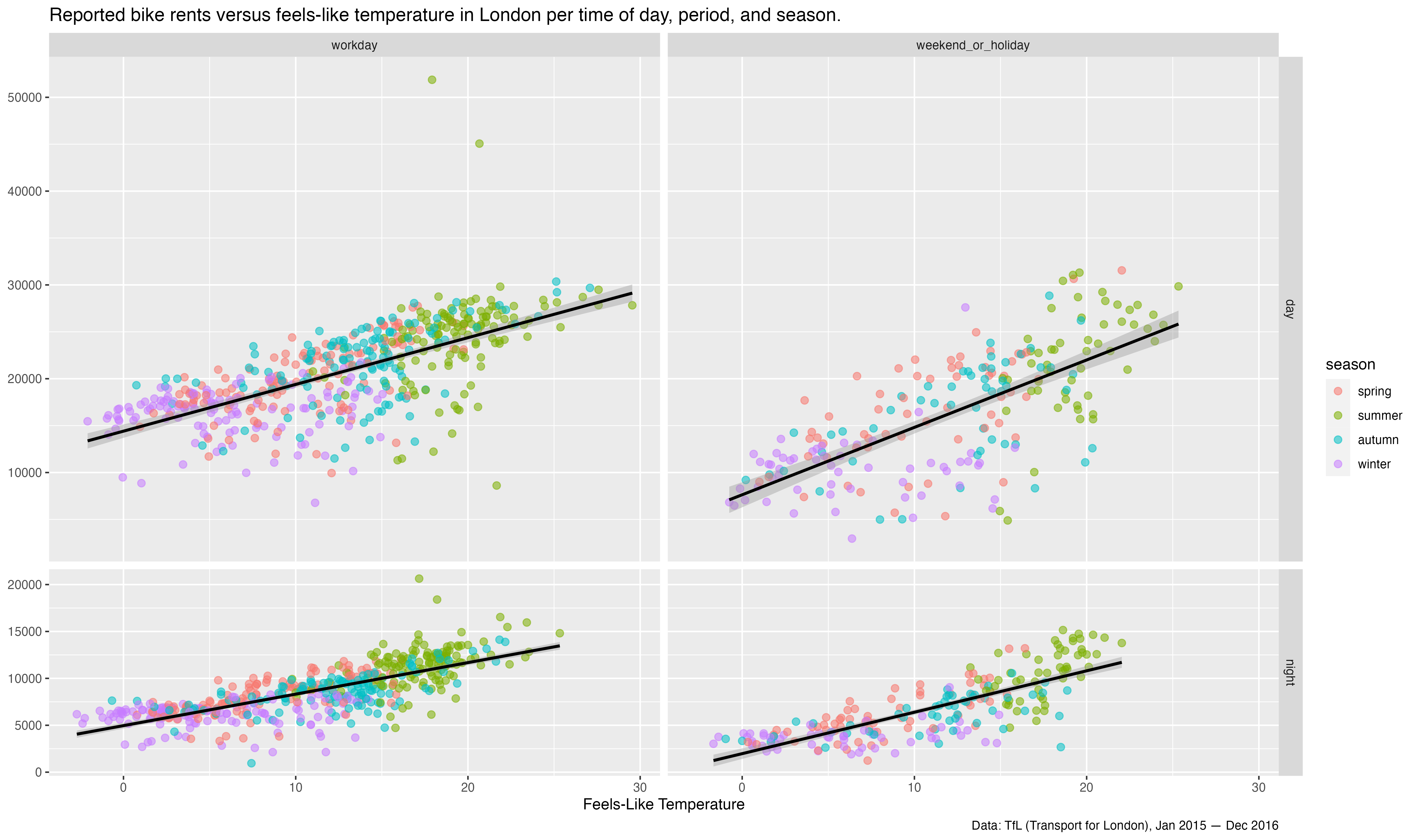
ggplot(bikes, aes(temp_feel, count)) +
## format seasons
geom_point(
aes(color = forcats::fct_relabel(season, stringr::str_to_title)),
size = 2.2, alpha = .55
) +
geom_smooth(
aes(group = day_night),
method = "lm", color = "black"
) +
## format facet strip text
facet_grid(
day_night ~ is_workday,
scales = "free_y", space = "free_y",
labeller = labeller(
day_night = stringr::str_to_title,
is_workday = codes
)
) +
## customize x axis
scale_x_continuous(
expand = c(.02, .02),
breaks = 0:6*5, labels = function(x) paste0(x, "°C")
) +
## customize y axis
scale_y_continuous(
expand = c(.1, .1), limits = c(0, NA),
breaks = 0:5*10000, labels = scales::comma_format()
) +
scale_color_manual(
values = c("#3c89d9", "#1ec99b", "#F7B01B", "#a26e7c"), name = NULL,
guide = guide_legend(override.aes = list(size = 5))
) +
labs(
x = "Feels-Like Temperature", y = NULL,
caption = "Data: TfL (Transport for London), Jan 2015 — Dec 2016",
title = "Reported bike rents versus feels-like temperature in London per time of day, period, and season."
) +
theme_light(
base_size = 18, base_family = "Cabinet Grotesk"
) +
## theme adjustments
theme(
plot.title.position = "plot",
plot.caption.position = "plot",
plot.title = element_text(face = "bold"),
strip.text = element_text(face = "bold"),
legend.position = "top"
)
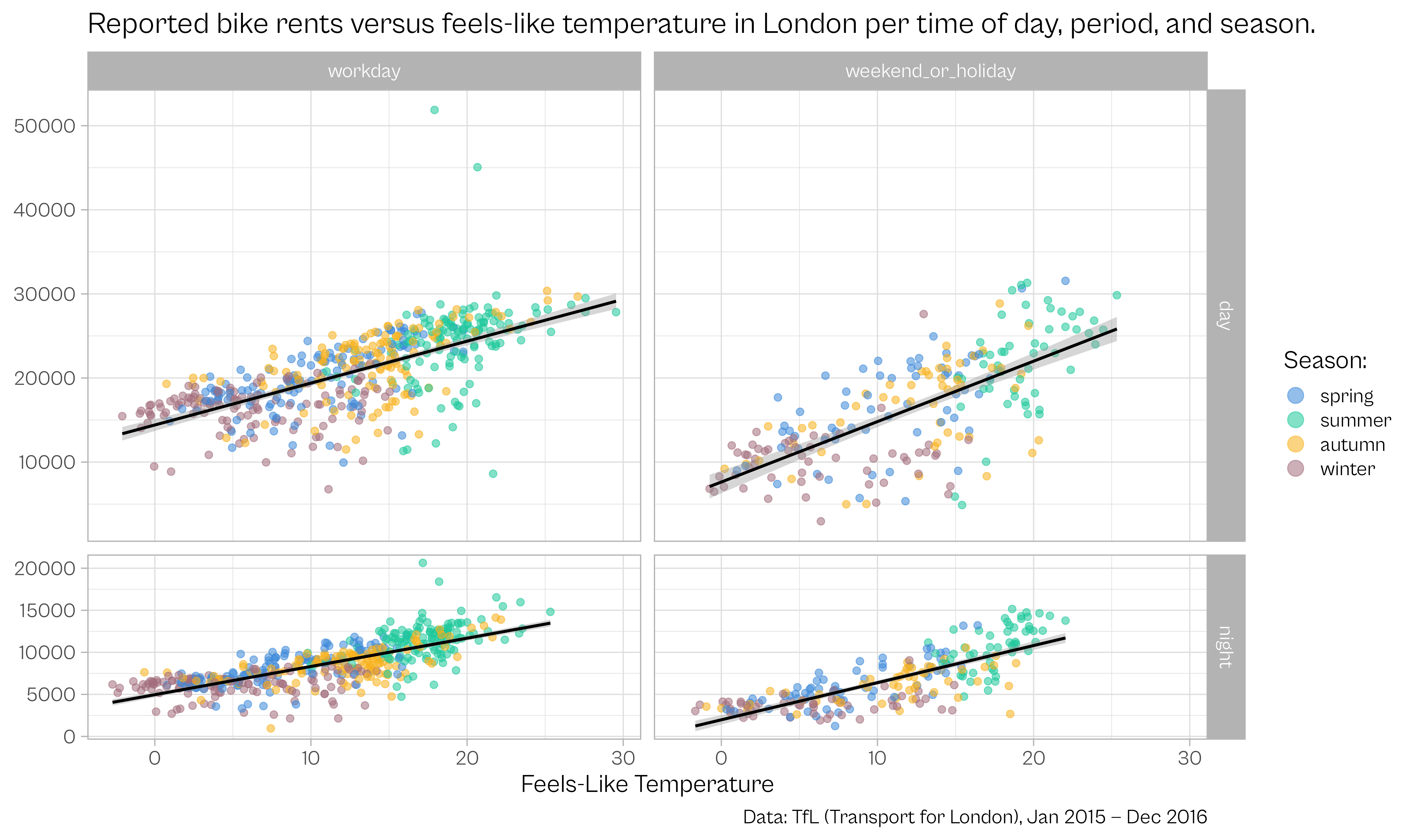
codes <- c(
workday = "Workday",
weekend_or_holiday = "Weekend or Holiday"
)
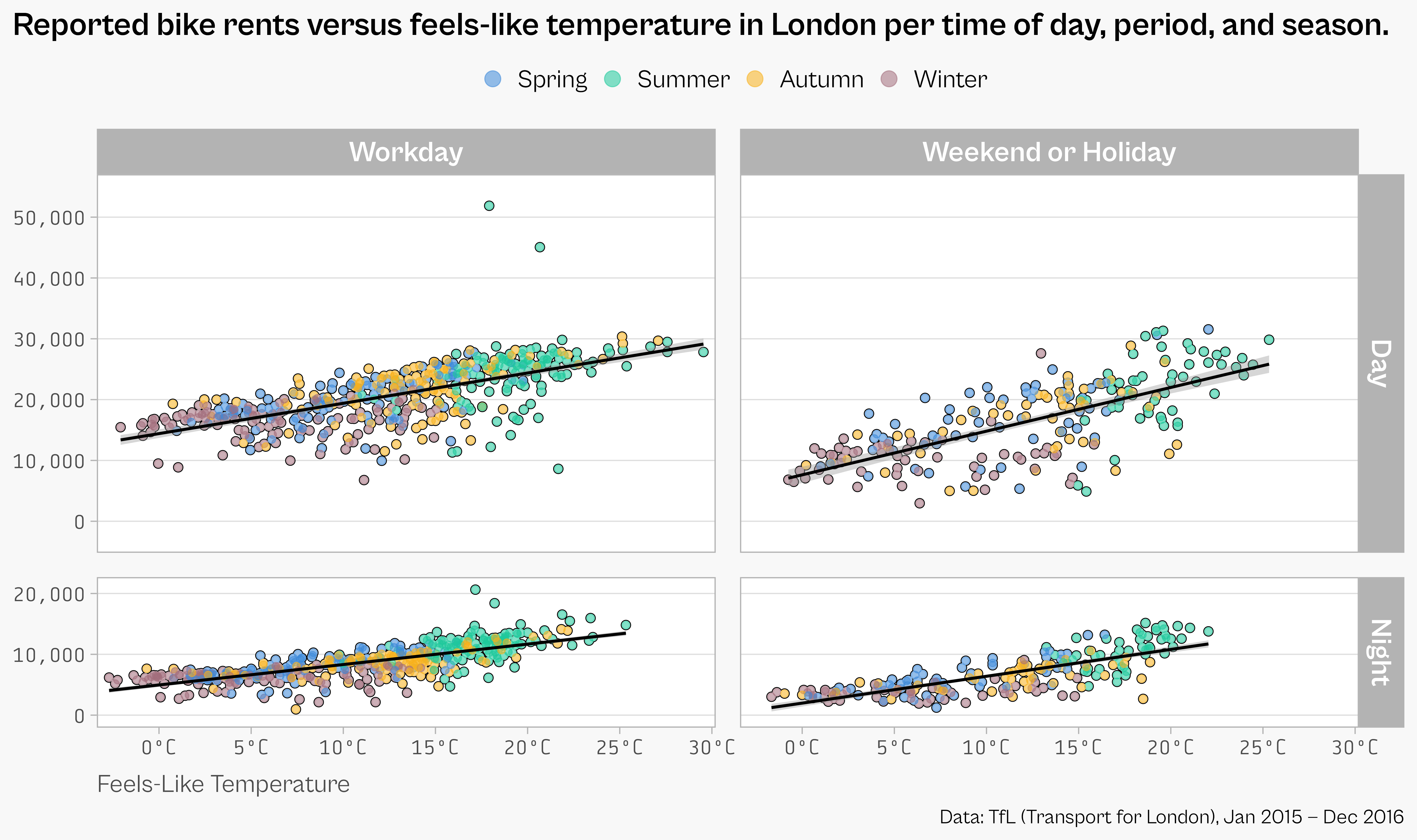
ggplot(bikes, aes(temp_feel, count)) +
## point outline
geom_point(
color = "black", fill = "white",
shape = 21, size = 2.8
) +
## opaque point background
geom_point(
color = "white", size = 2.2
) +
## colored, semi-transparent points
geom_point(
aes(color = forcats::fct_relabel(season, stringr::str_to_title)),
size = 2.2, alpha = .55
) +
geom_smooth(
aes(group = day_night), method = "lm", color = "black"
) +
facet_grid(
day_night ~ is_workday,
scales = "free_y", space = "free_y",
labeller = labeller(
day_night = stringr::str_to_title,
is_workday = codes
)
) +
scale_x_continuous(
expand = c(.02, .02),
breaks = 0:6*5, labels = function(x) paste0(x, "°C")
) +
scale_y_continuous(
expand = c(.1, .1), limits = c(0, NA),
breaks = 0:5*10000, labels = scales::comma_format()
) +
scale_color_manual(
values = c("#3c89d9", "#1ec99b", "#F7B01B", "#a26e7c"), name = NULL,
guide = guide_legend(override.aes = list(size = 5))
) +
labs(
x = "Feels-Like Temperature", y = NULL,
caption = "Data: TfL (Transport for London), Jan 2015 — Dec 2016",
title = "Reported bike rents versus feels-like temperature in London per time of day, period, and season."
) +
theme_light(
base_size = 18, base_family = "Cabinet Grotesk"
) +
## more theme adjustments
theme(
plot.title.position = "plot",
plot.caption.position = "plot",
plot.title = element_text(face = "bold", size = rel(1.3)),
axis.text = element_text(family = "Tabular"),
axis.title.x = element_text(hjust = 0, color = "grey30", margin = margin(t = 12)),
strip.text = element_text(face = "bold" , size = rel(1.15)),
panel.grid.major.x = element_blank(),
panel.grid.minor = element_blank(),
panel.spacing = unit(1.2, "lines"),
legend.position = "top",
legend.text = element_text(size = rel(1)),
## for fitting my slide background
legend.key = element_rect(color = "#f8f8f8", fill = "#f8f8f8"),
legend.background = element_rect(color = "#f8f8f8", fill = "#f8f8f8"),
plot.background = element_rect(color = "#f8f8f8", fill = "#f8f8f8")
)