Graphic Design with ggplot2
Concepts of the {ggplot2} Package Pt. 1:
Data, Aesthetics, and Layers + Misc Stuff
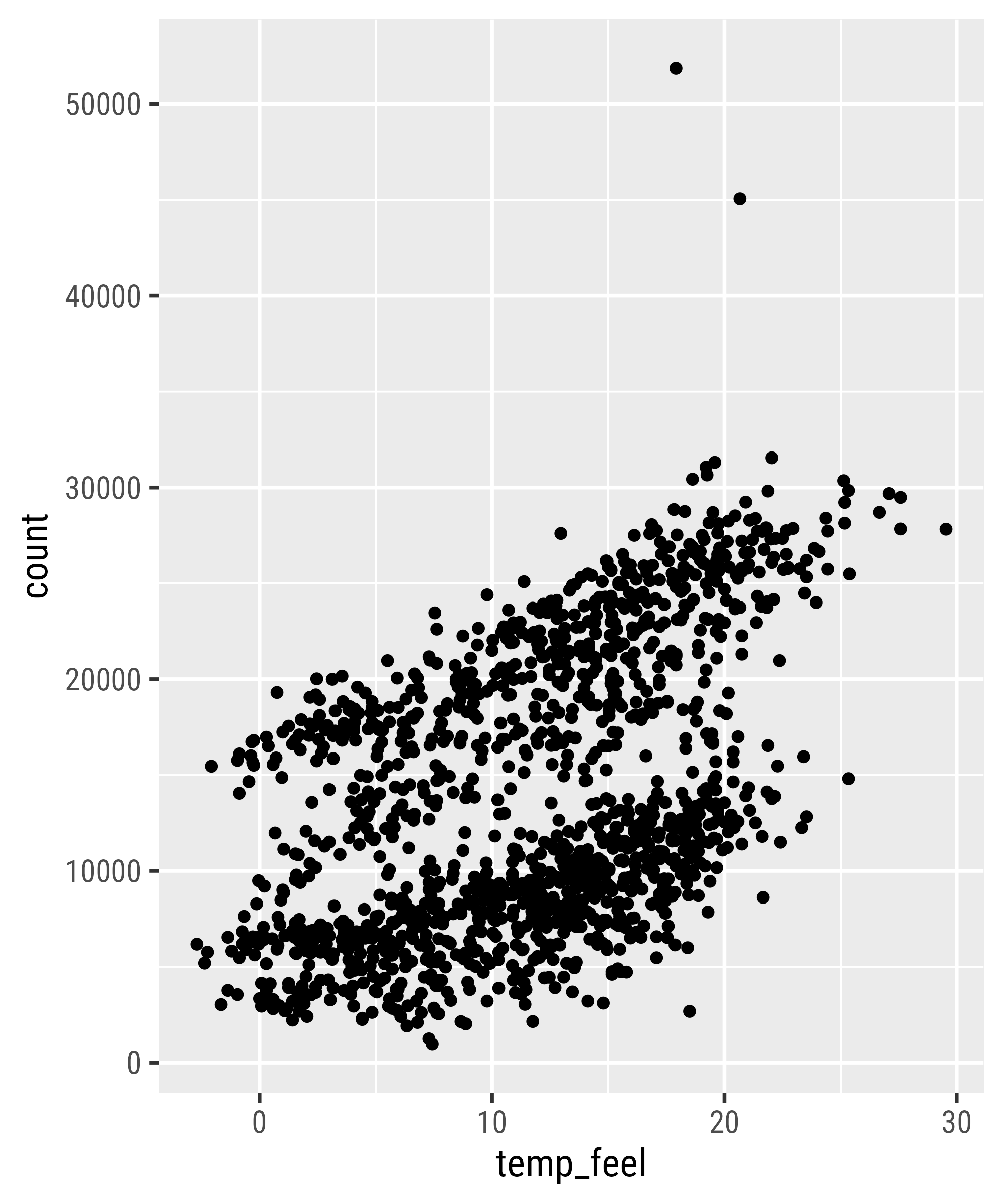
ggplot2::ggplot()
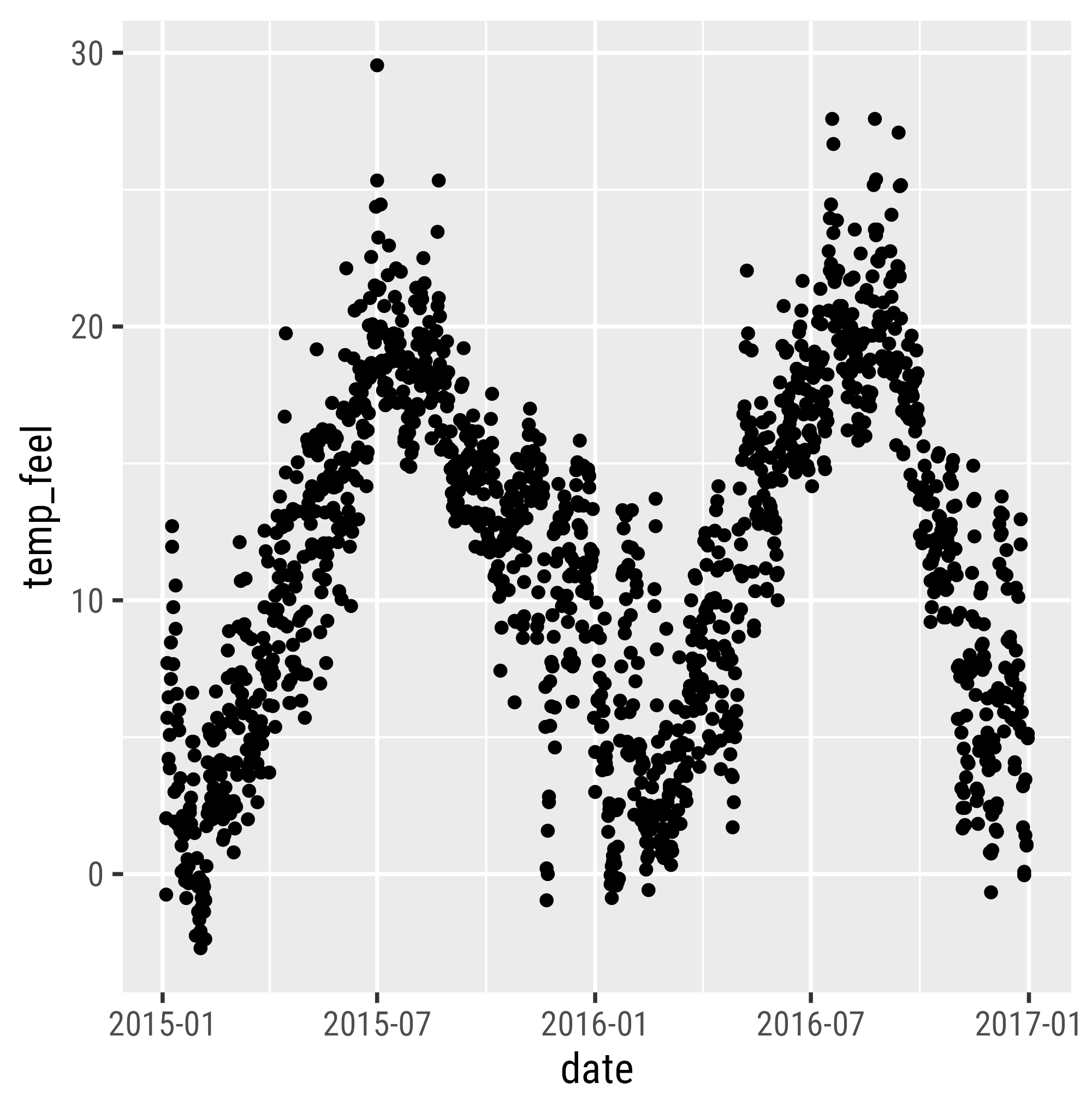
Data

Aesthetic Mapping
Geometries
Visual Properties of Layers
Setting vs Mapping of Visual Properties
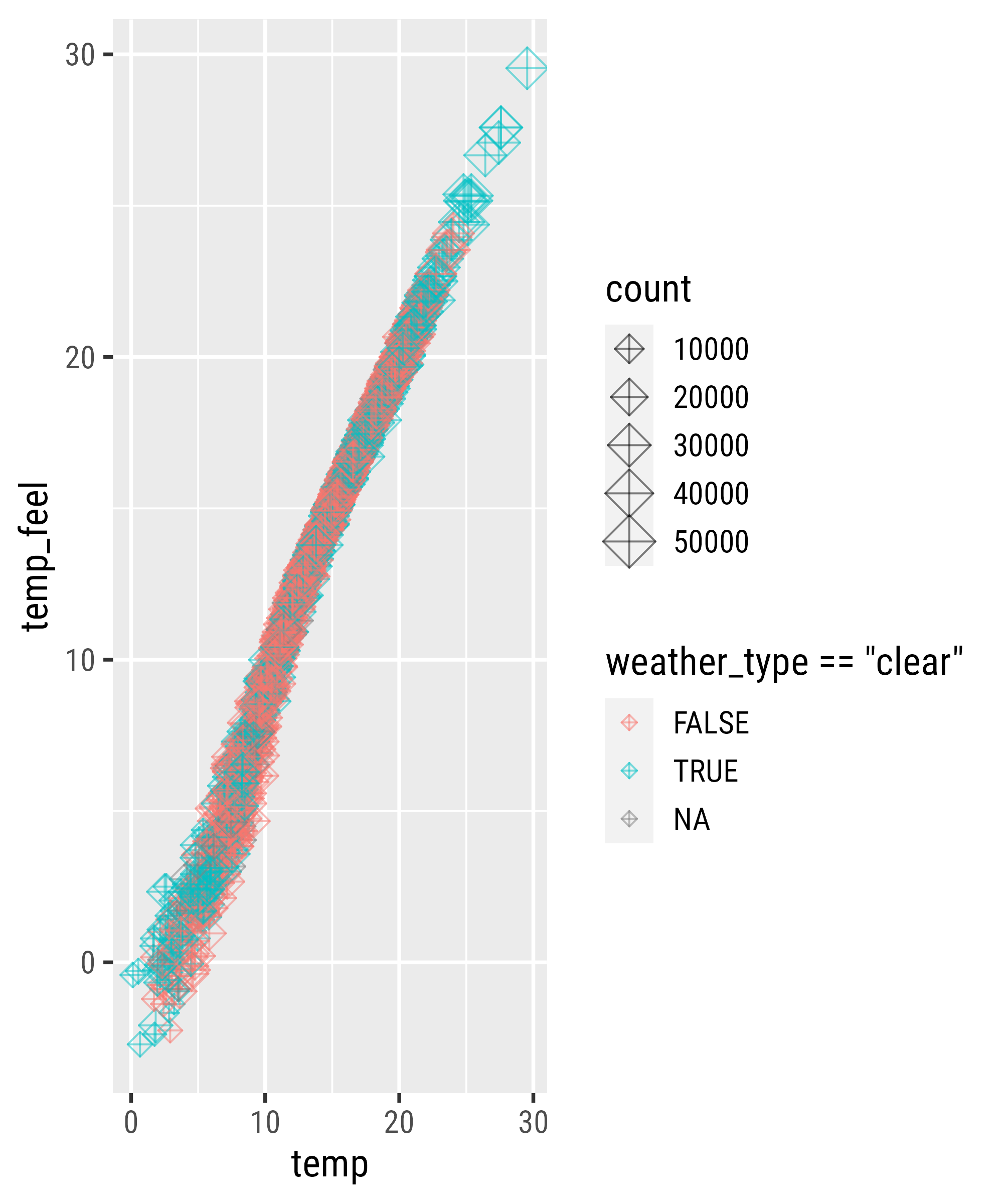
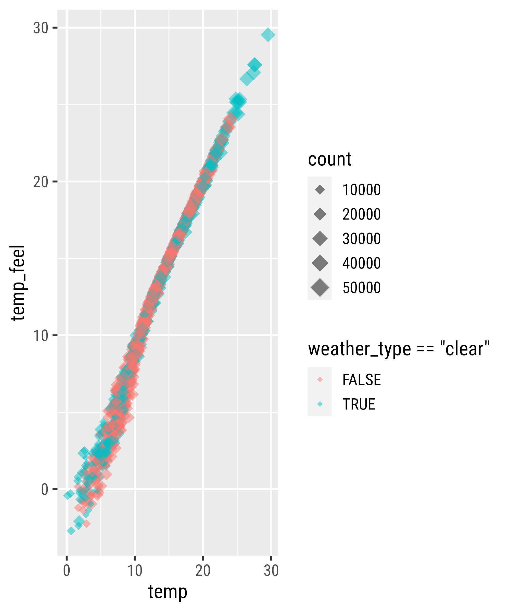
Mapping Expressions
Mapping Expressions
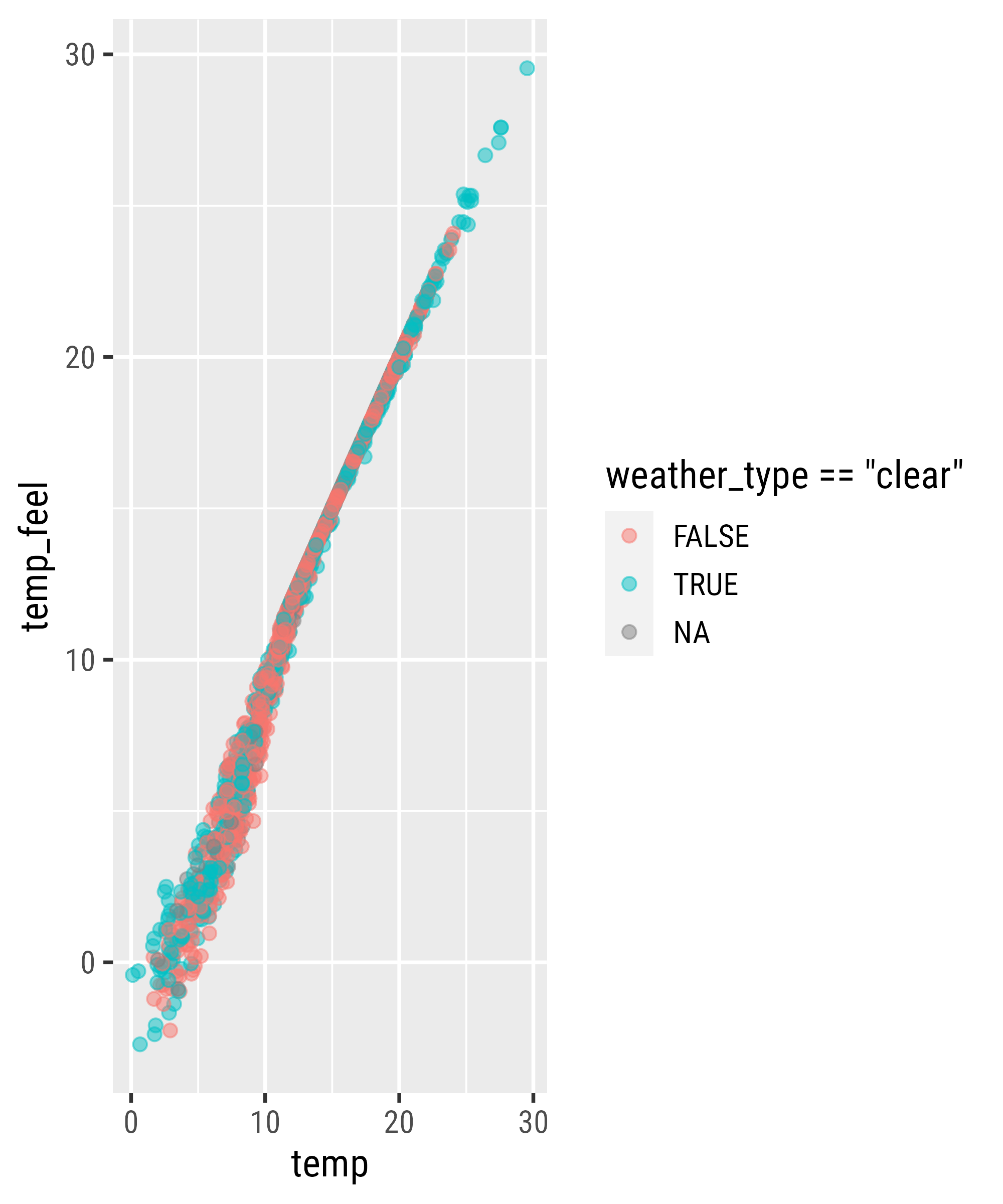
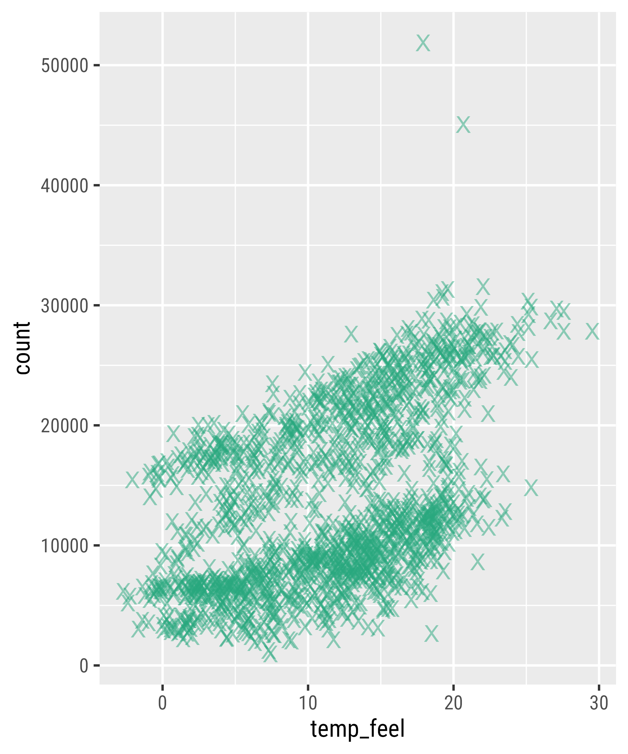
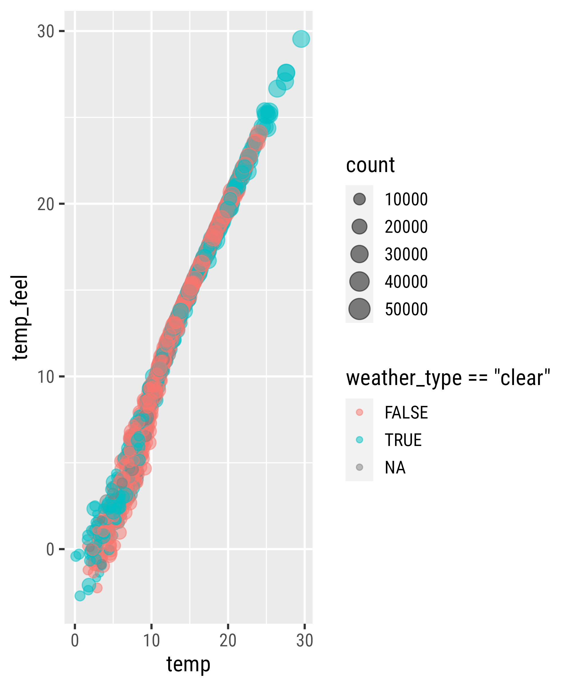
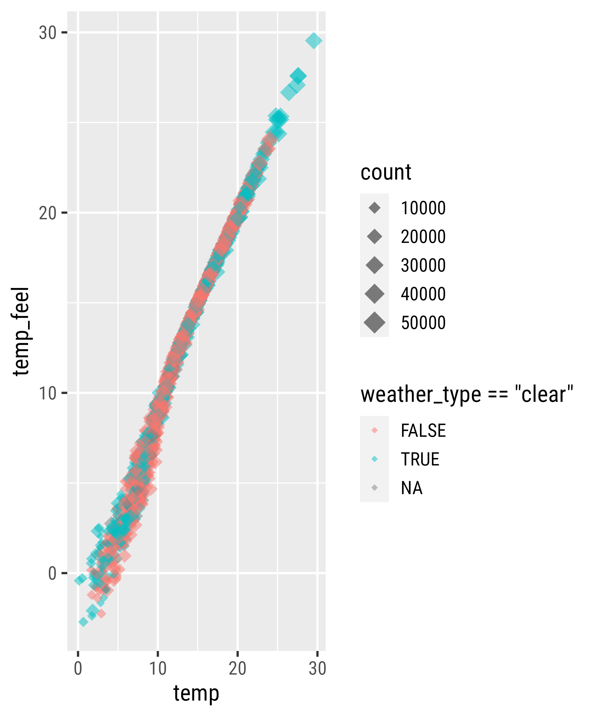
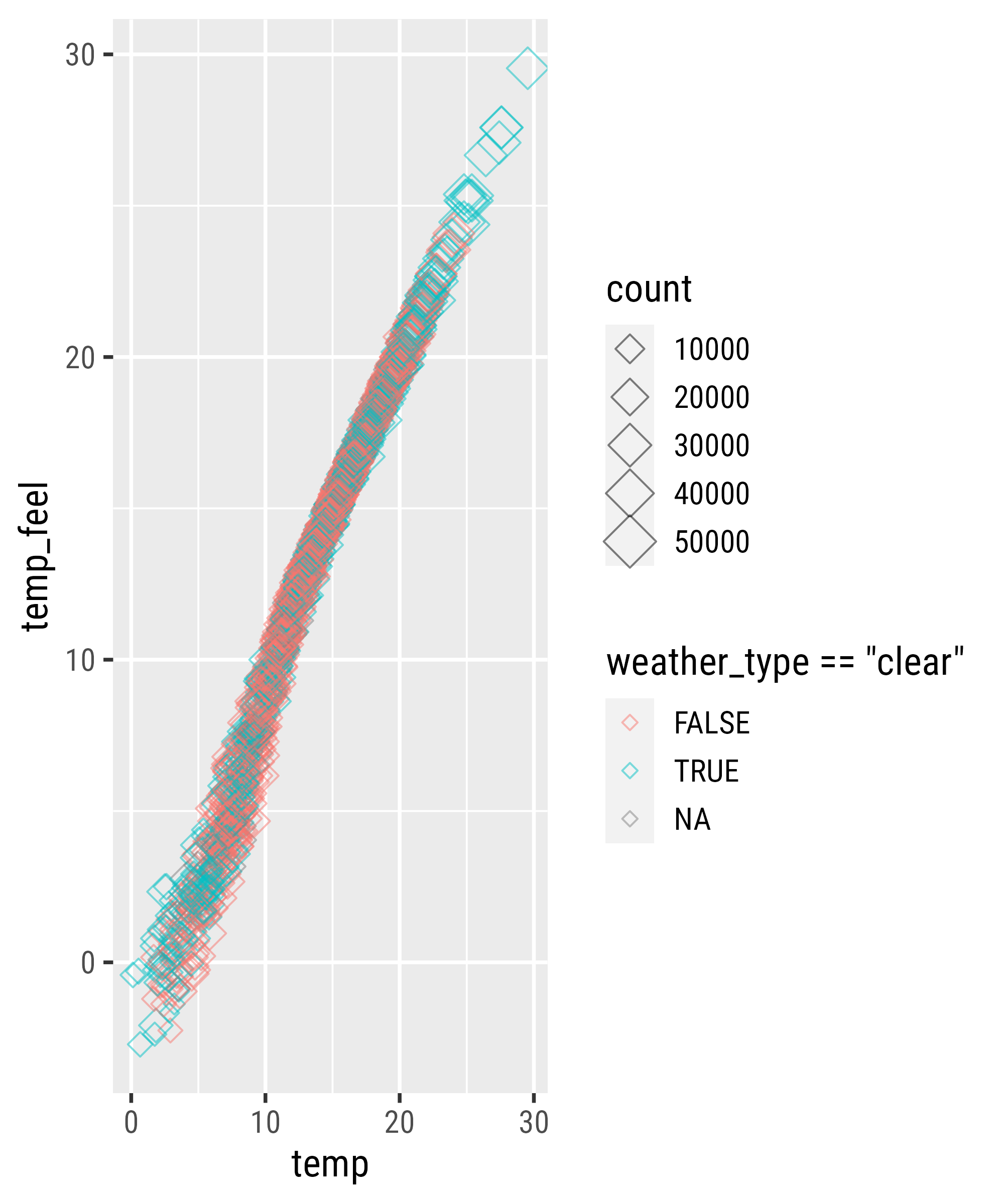
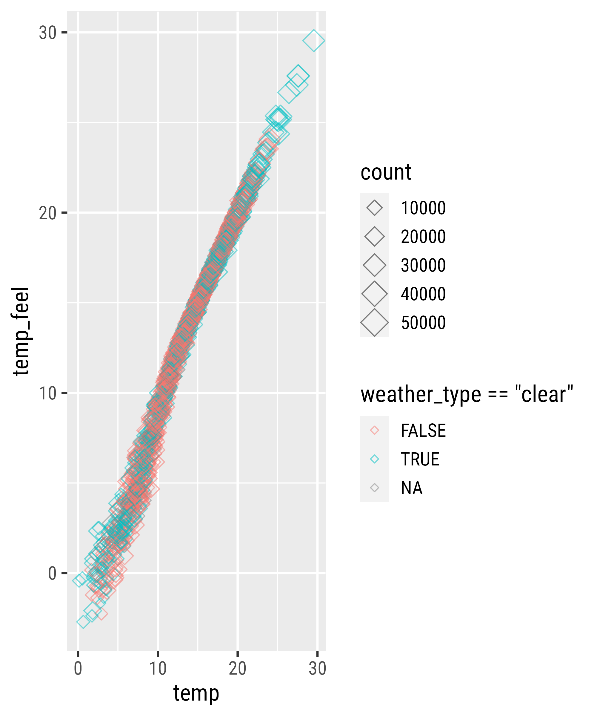
Mapping to Size
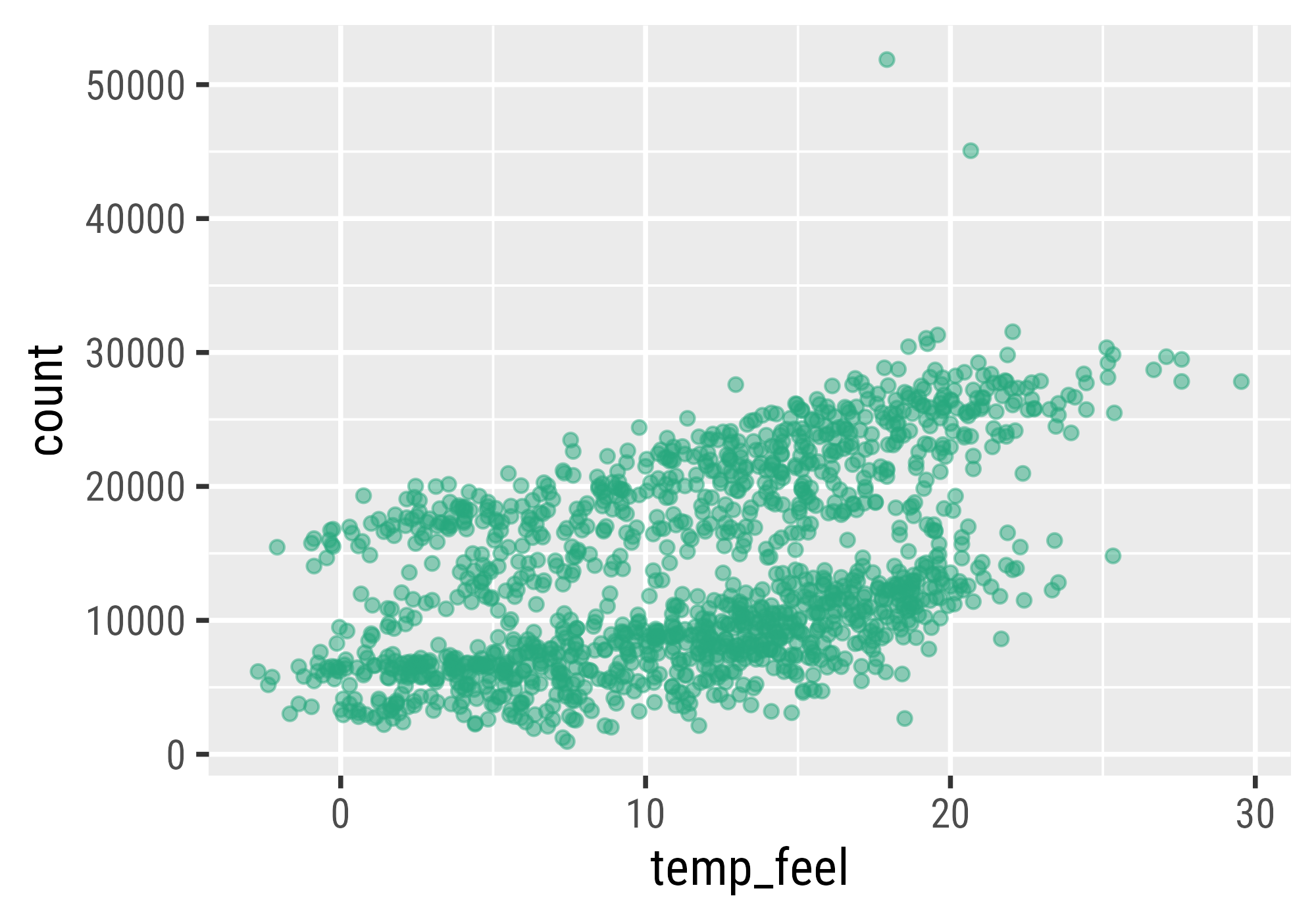
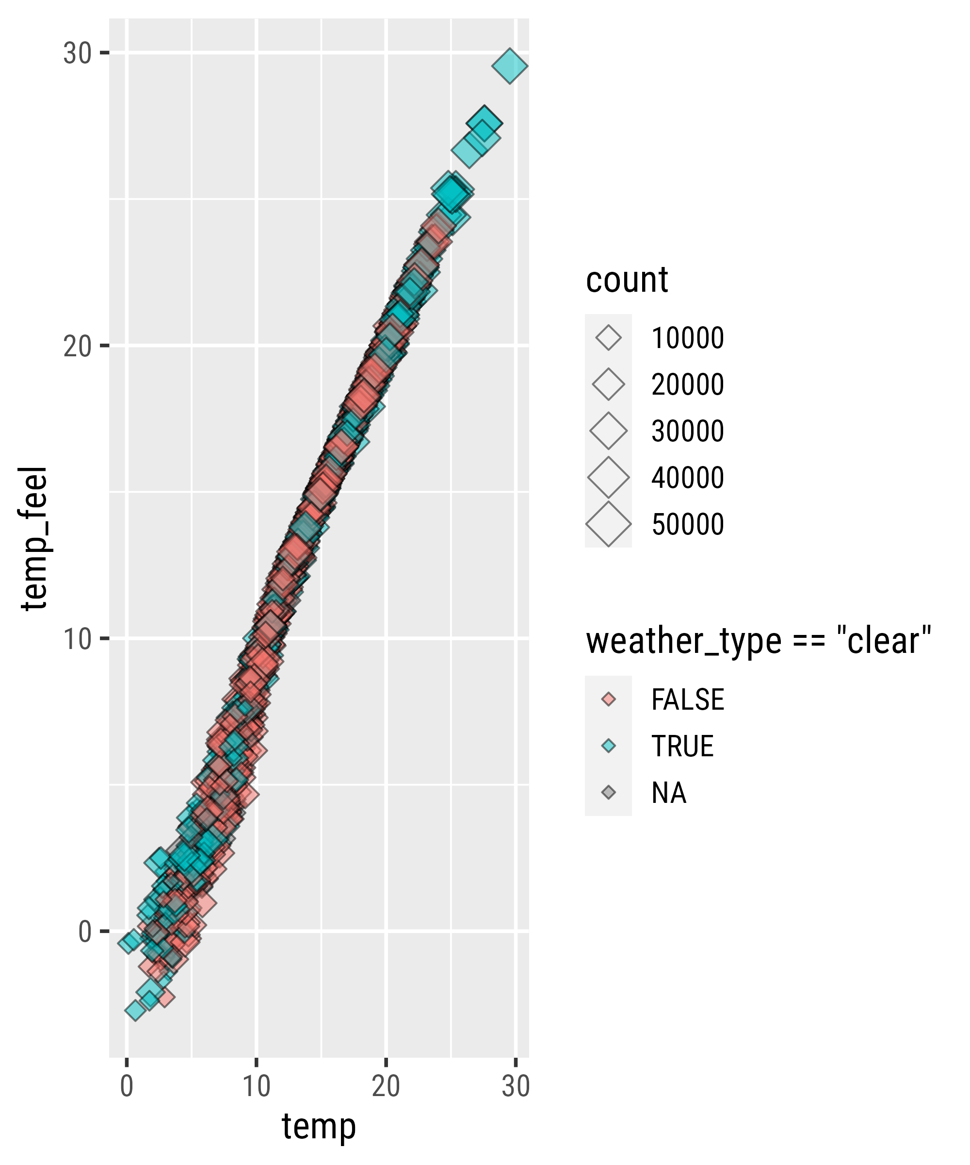
Setting a Constant Property
Setting a Constant Property
Setting a Constant Property
Setting a Constant Property
Source: Albert’s Blog
Setting a Constant Property
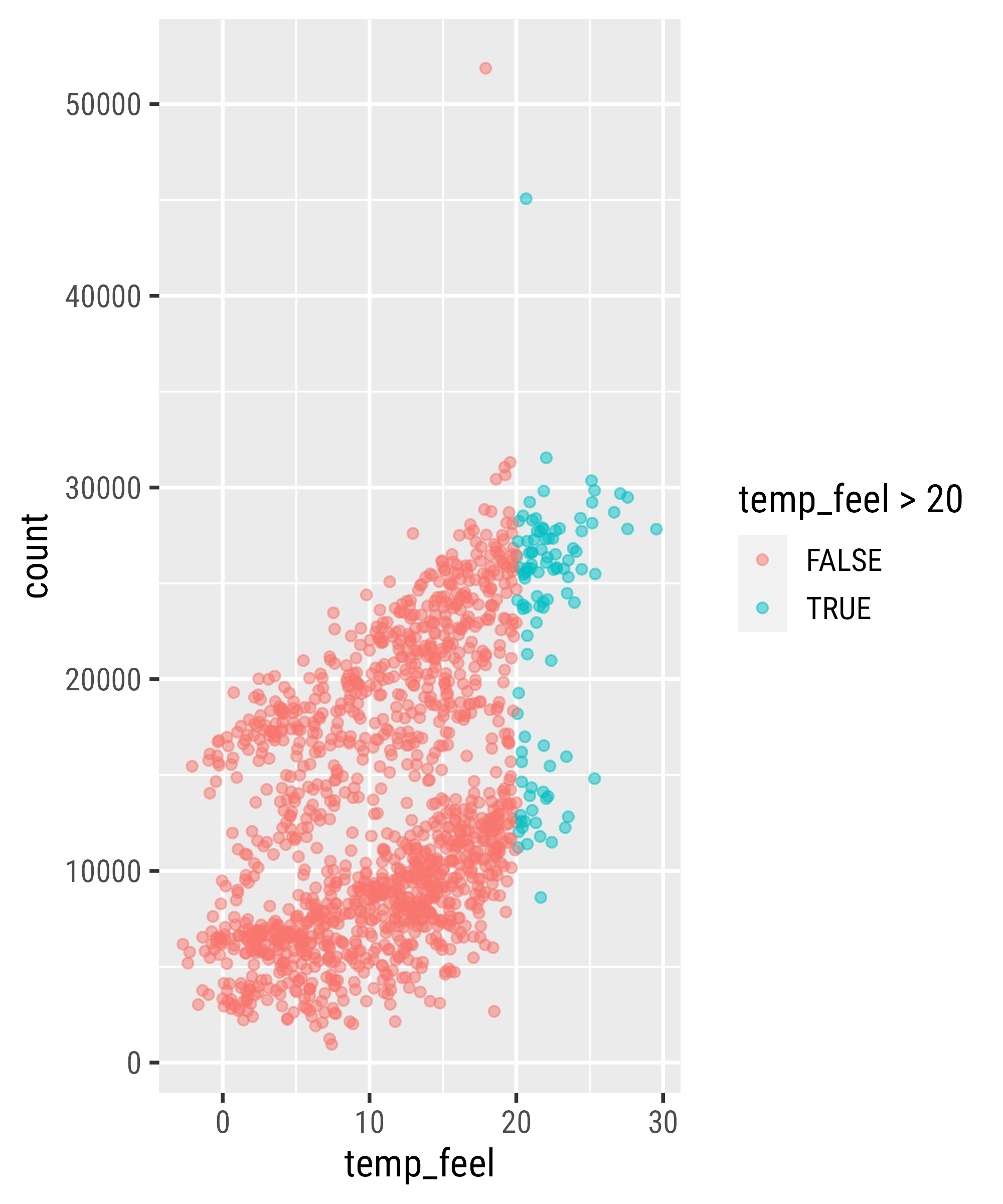
Filter Data
Filter Data

Local vs. Global Encoding

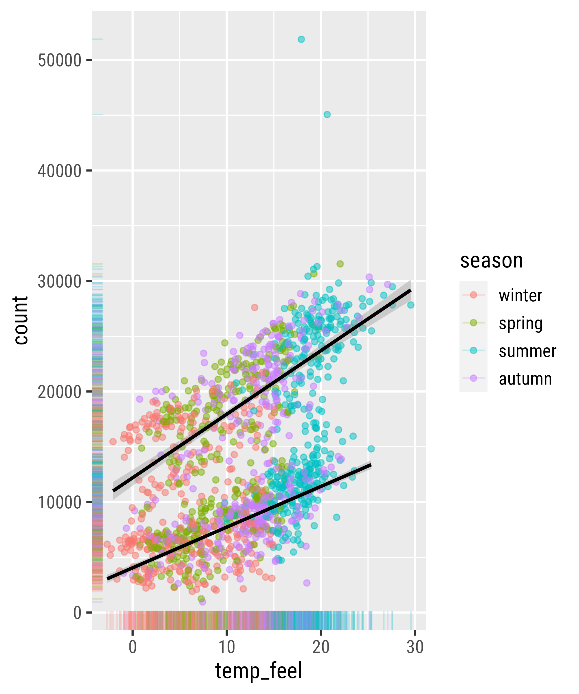
Adding More Layers

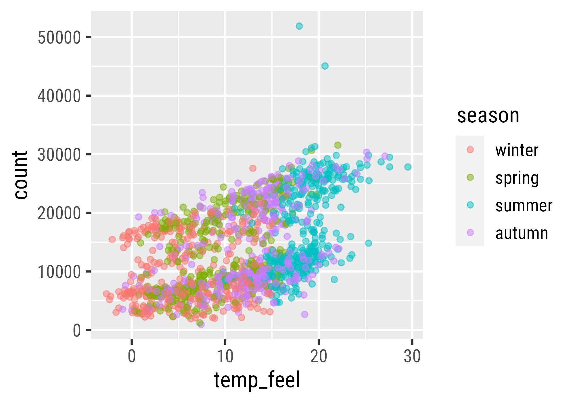
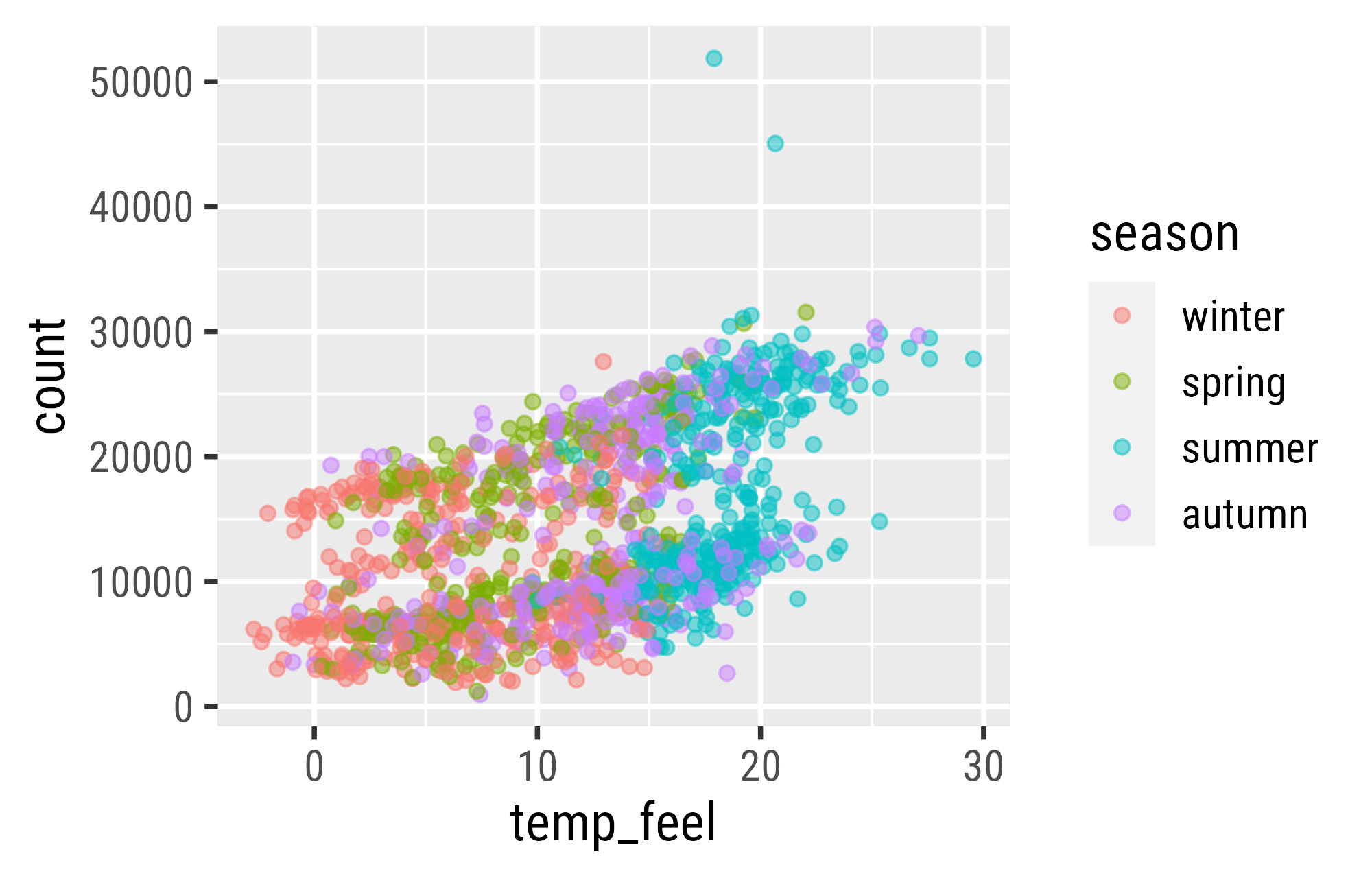
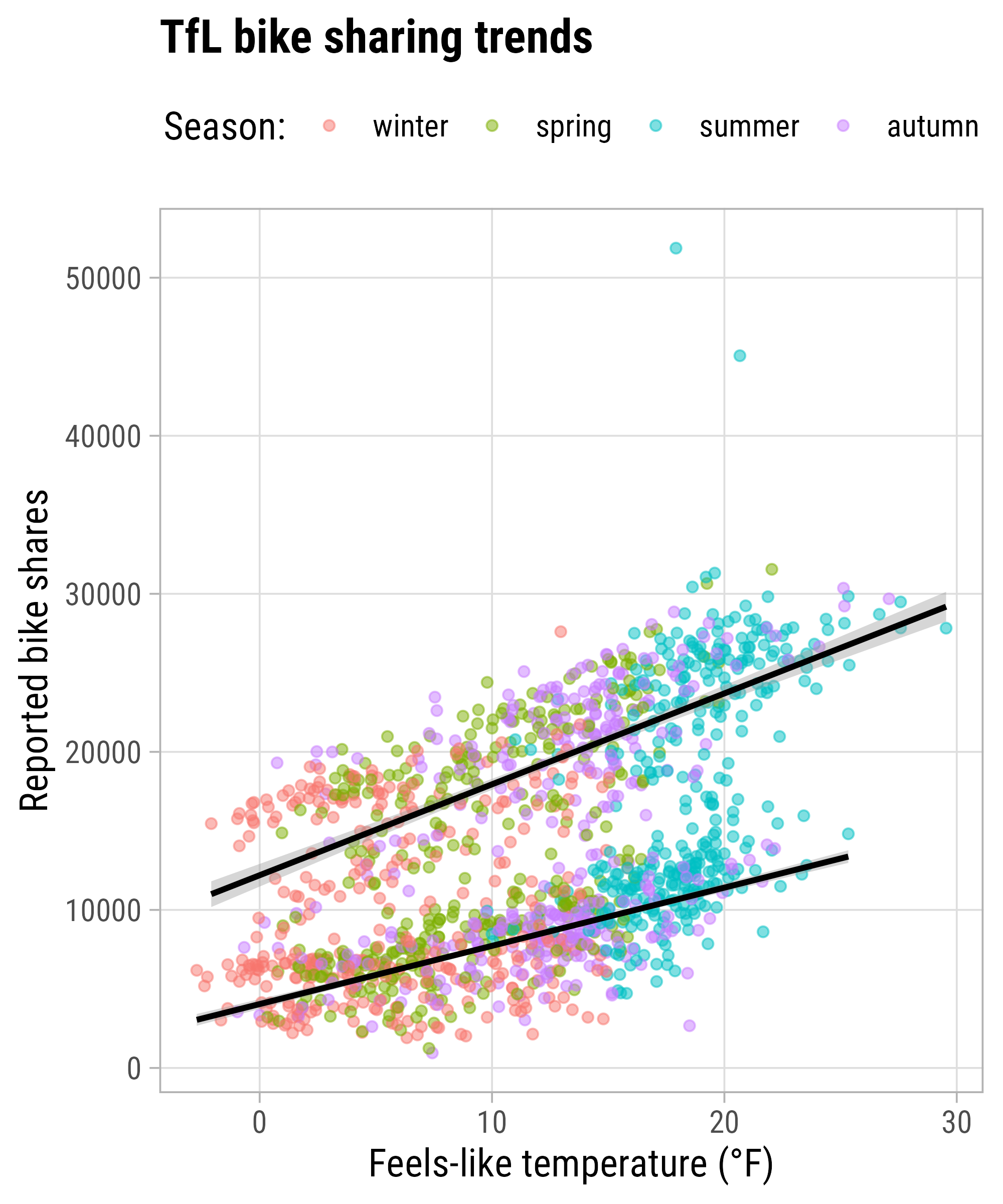
Global Color Encoding
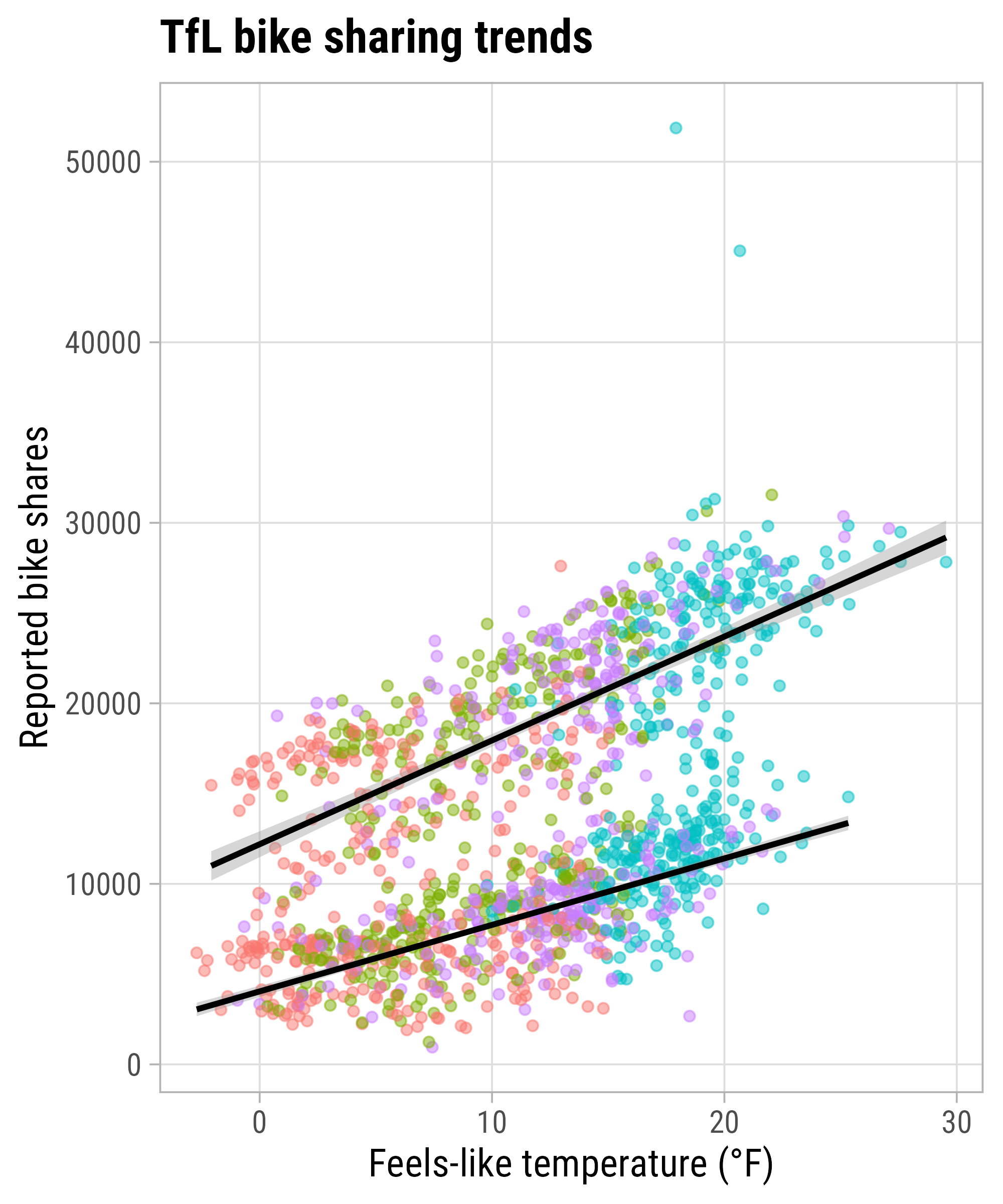
Local Color Encoding
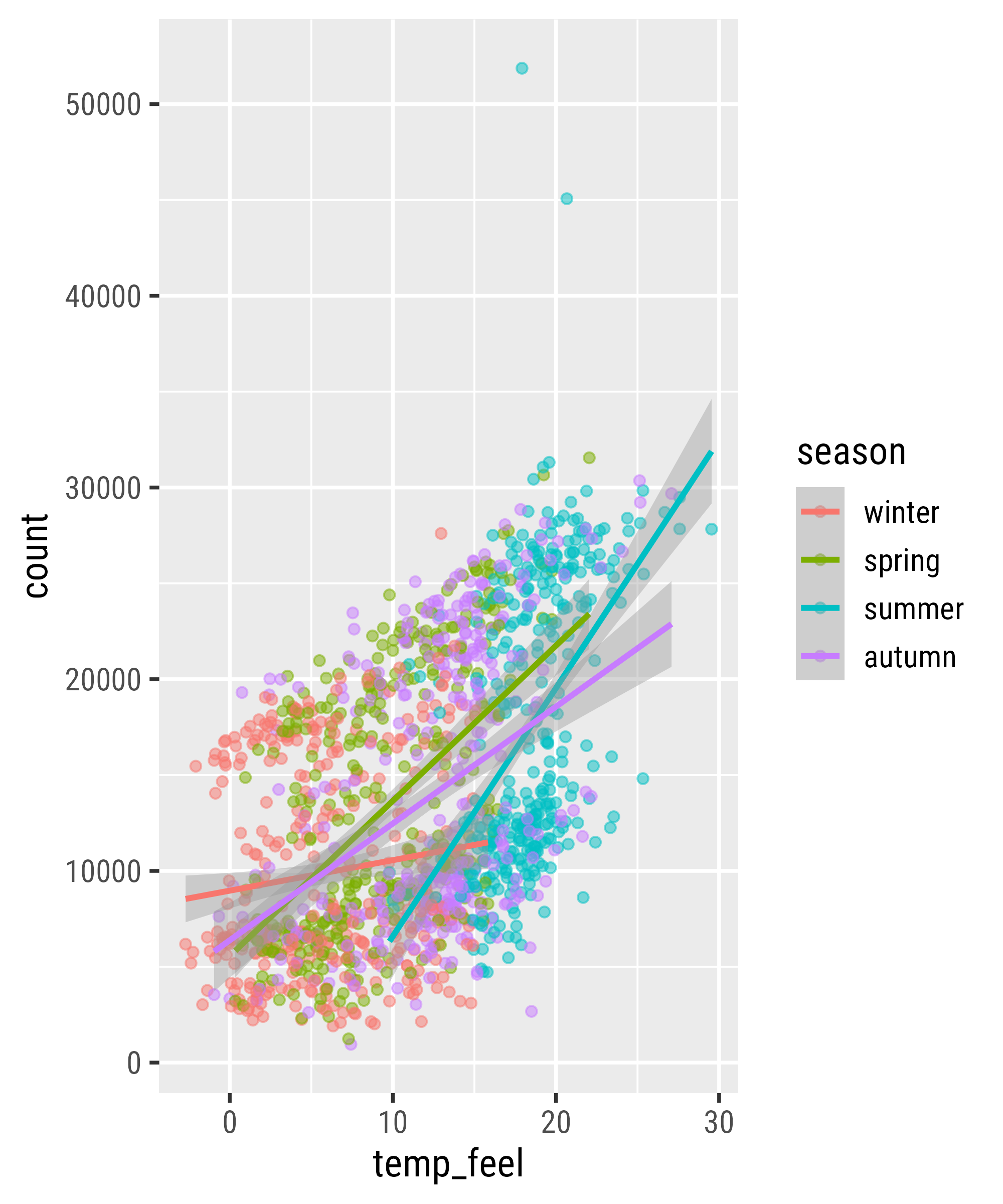
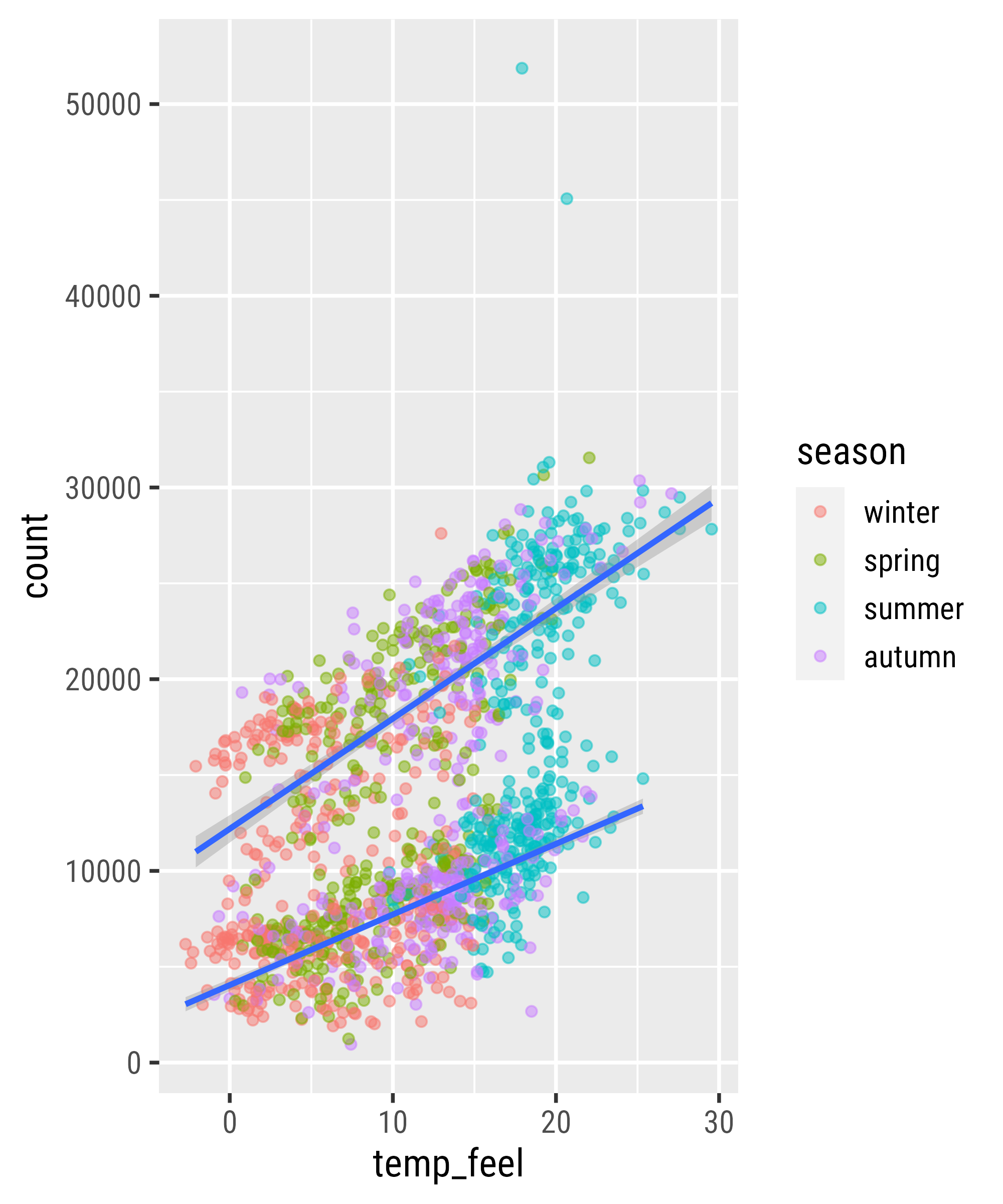
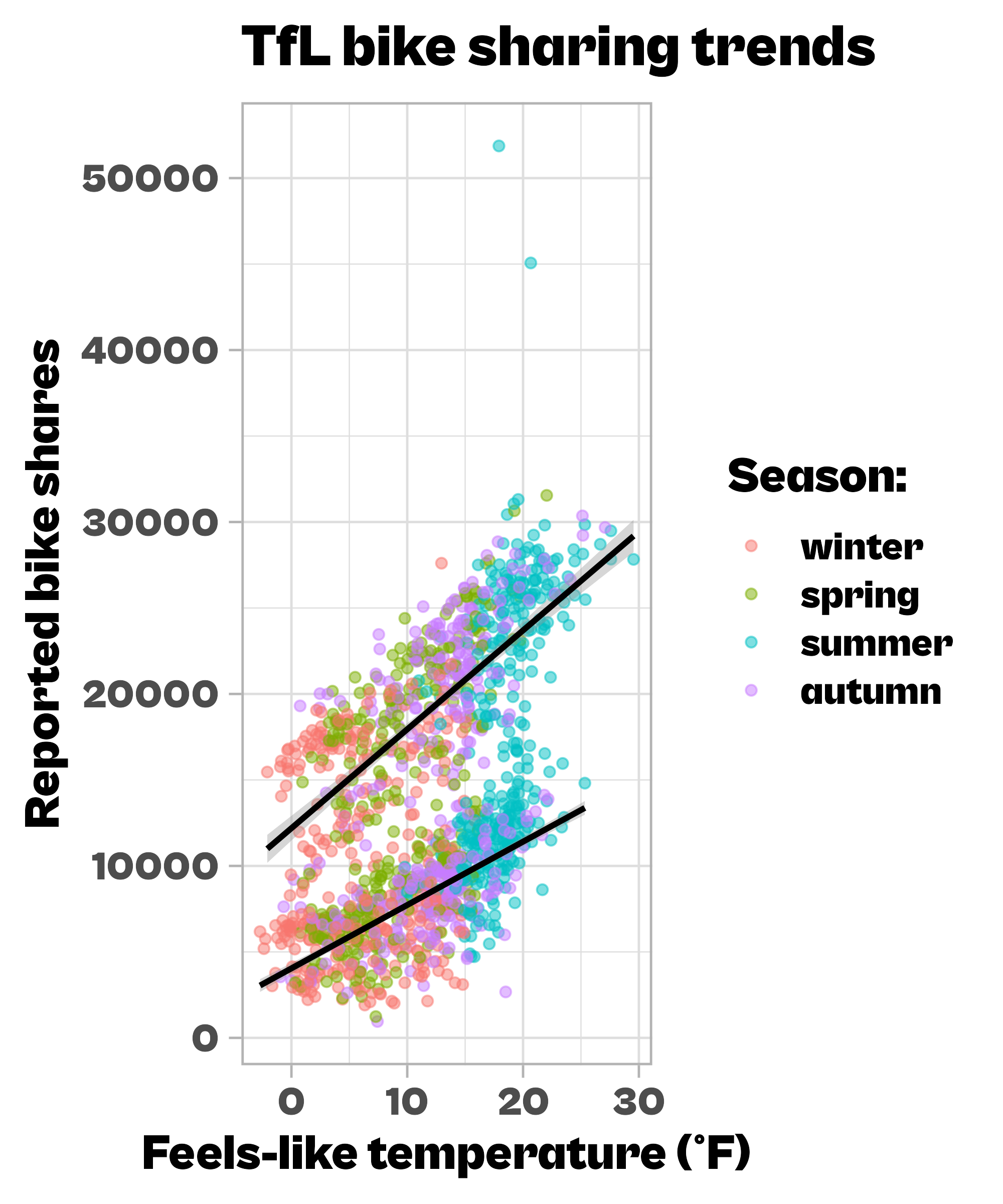
The `group` Aesthetic
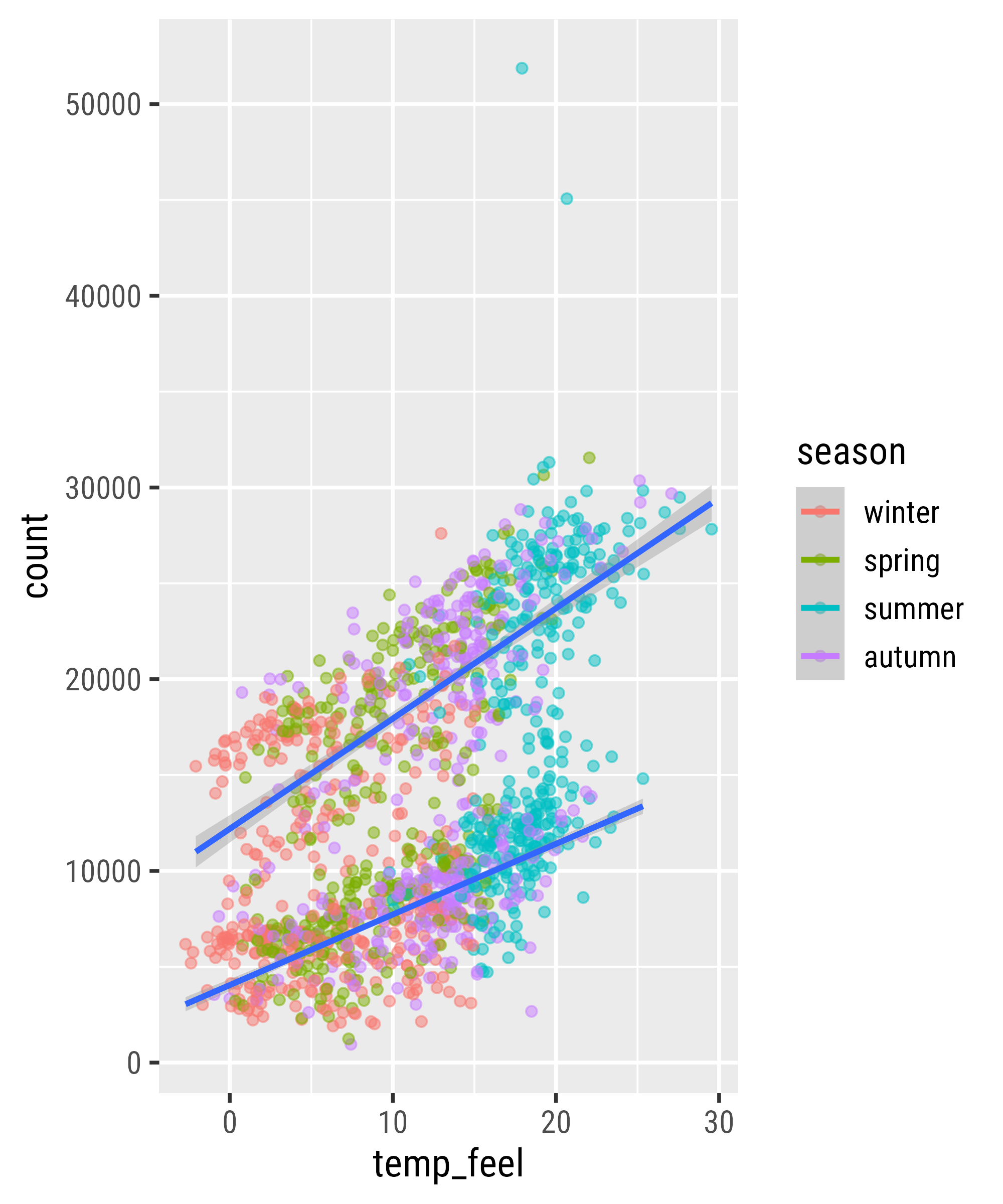
Set Both as Global Aesthetics
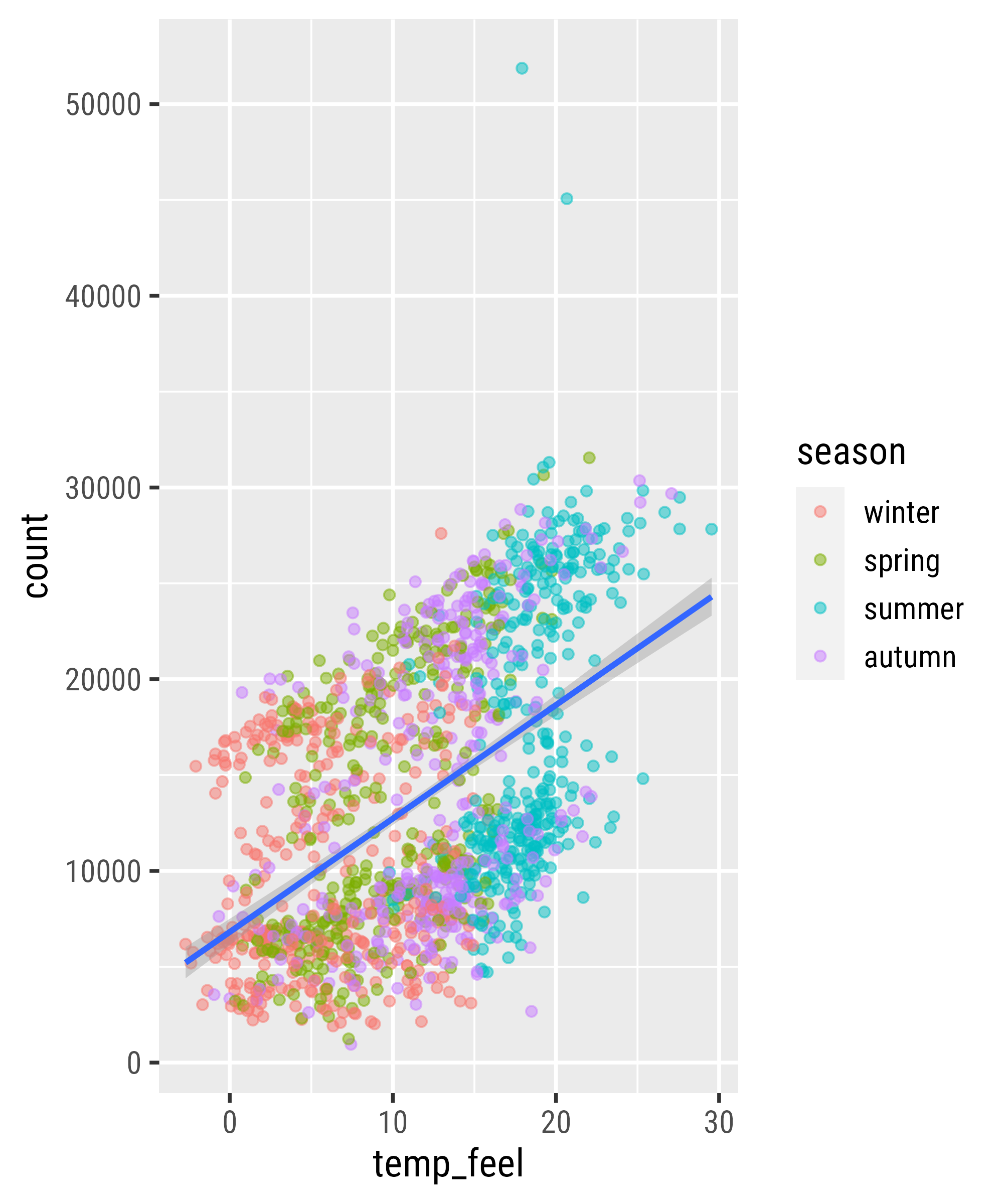
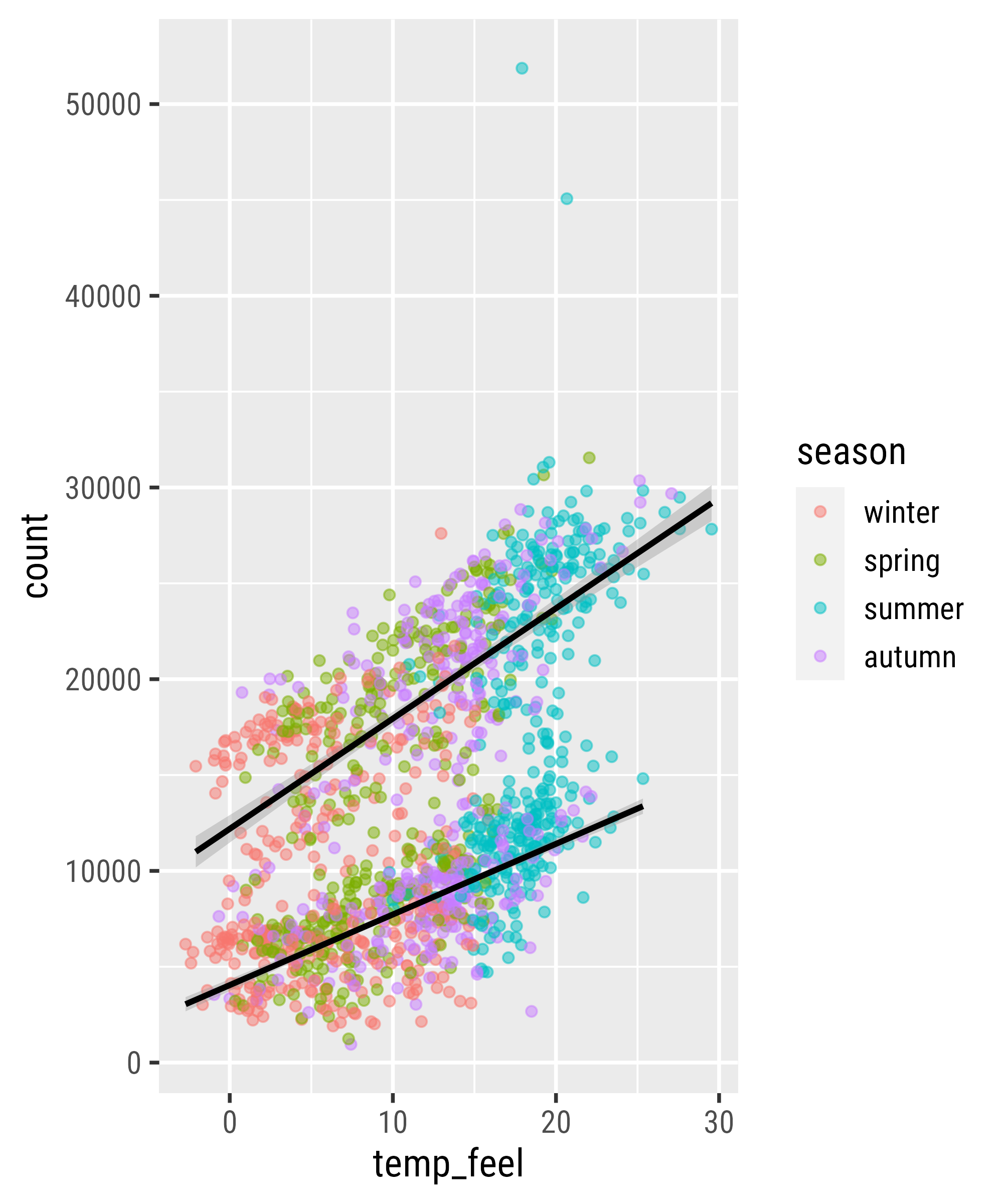
Overwrite Global Aesthetics
`stat_*()` and `geom_*()`

`stat_*()` and `geom_*()`

`stat_*()` and `geom_*()`

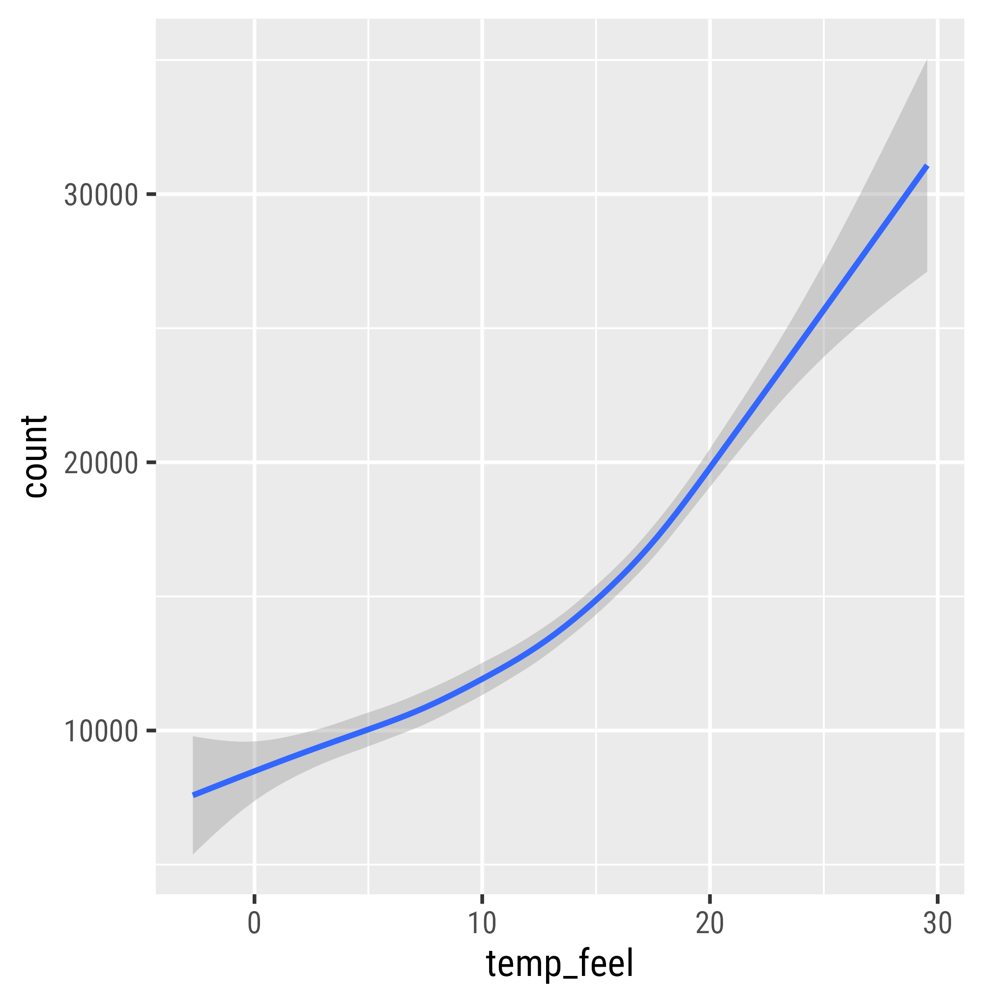
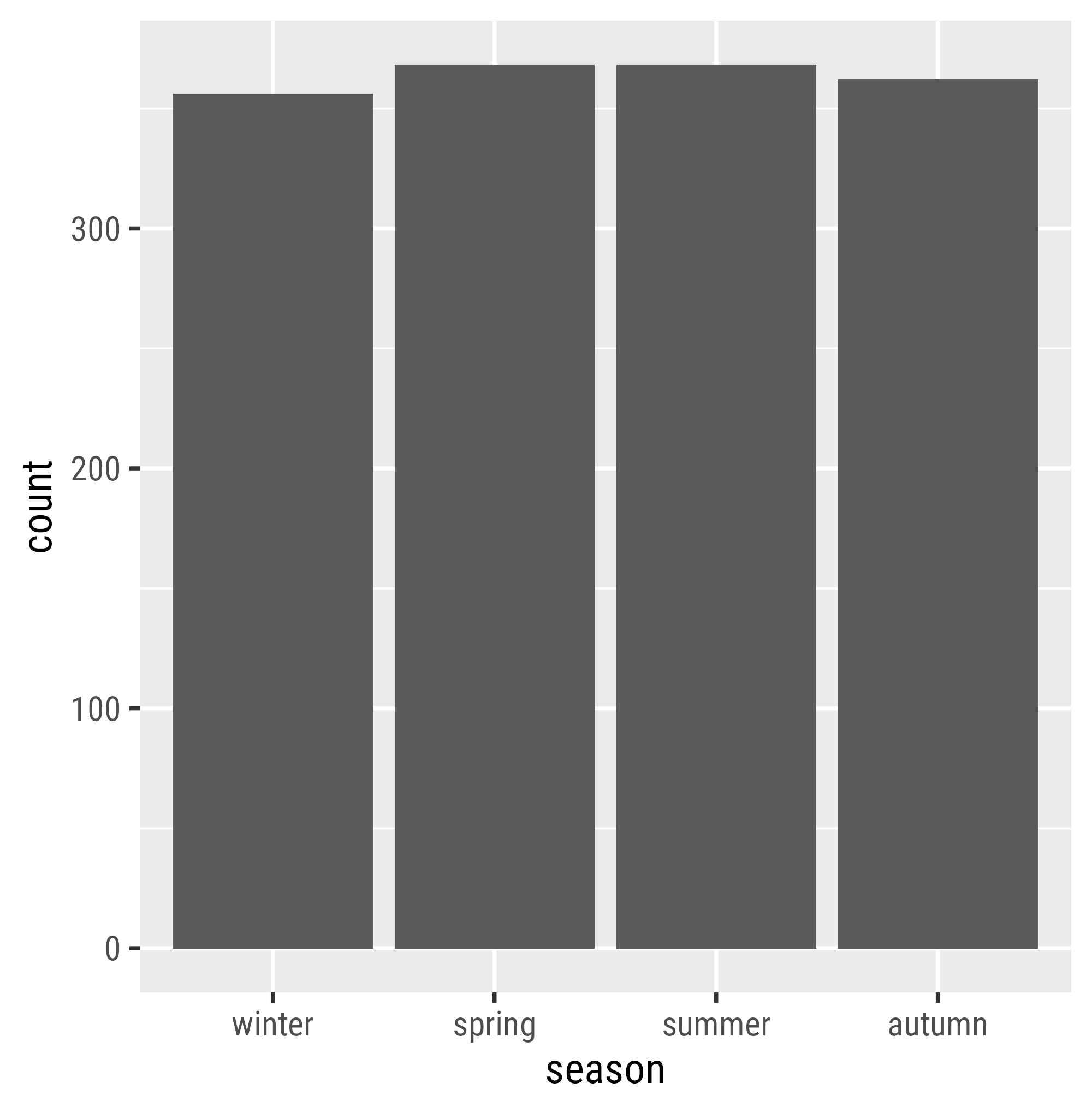
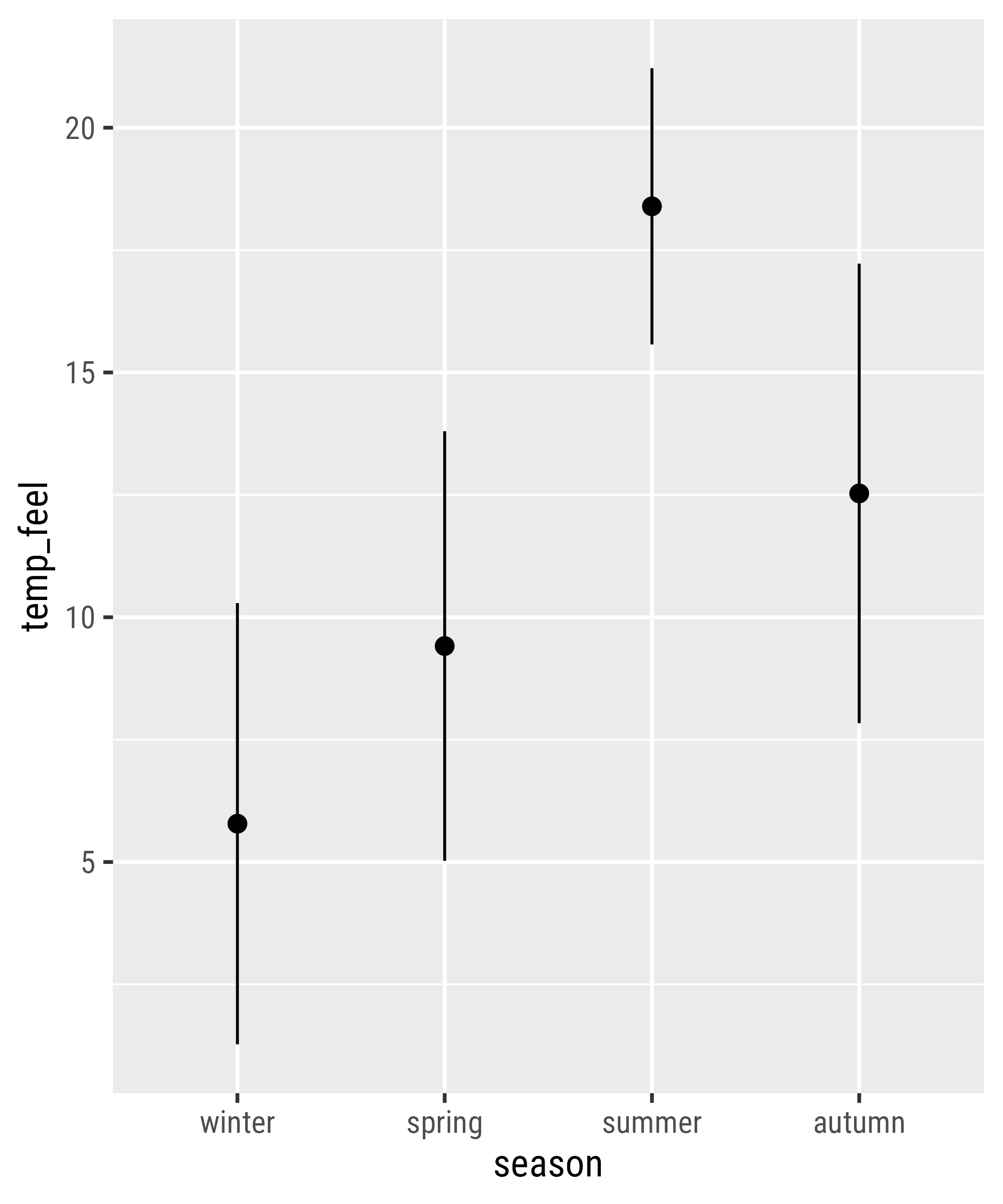
Statistical Summaries
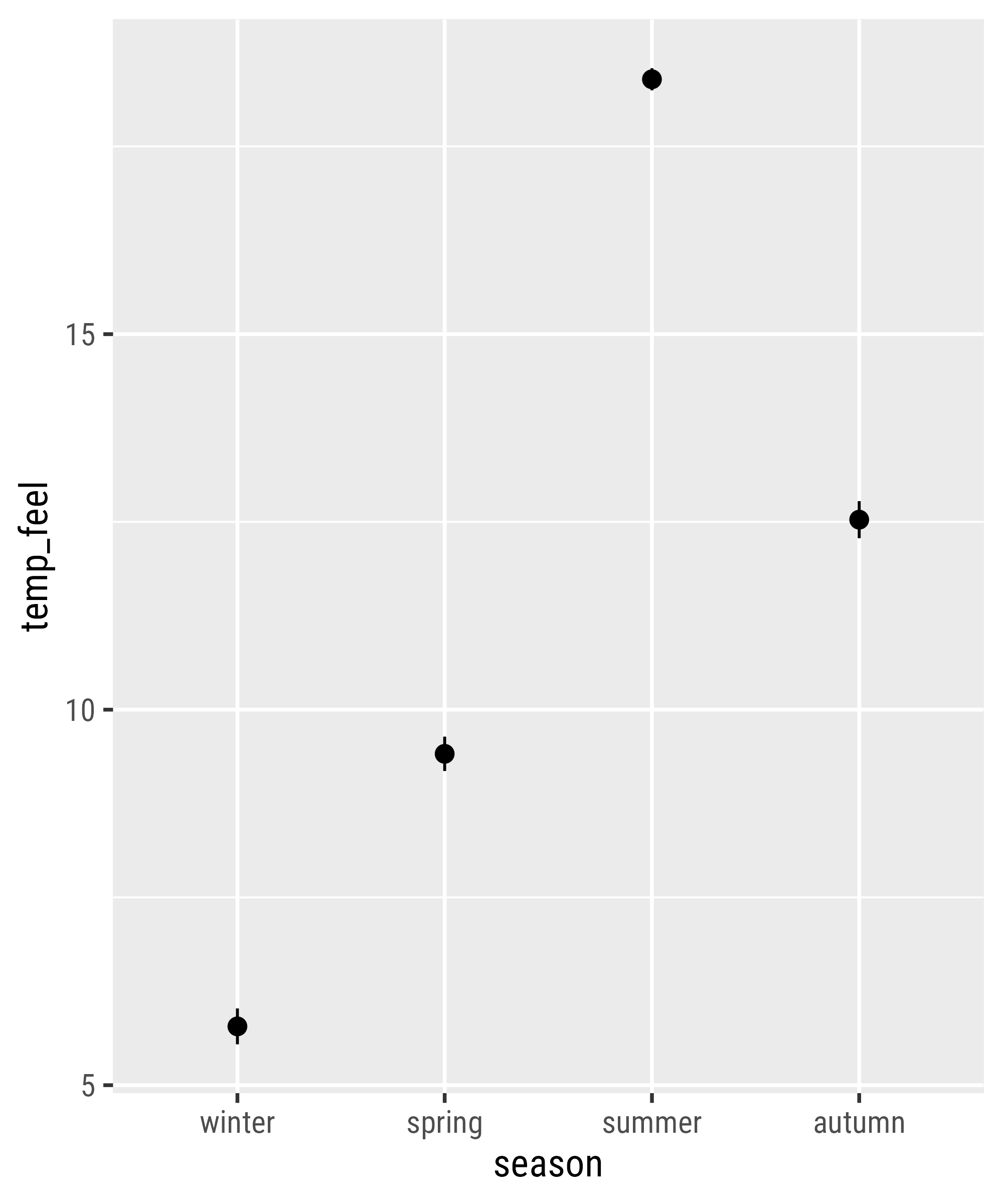
Statistical Summaries
Statistical Summaries
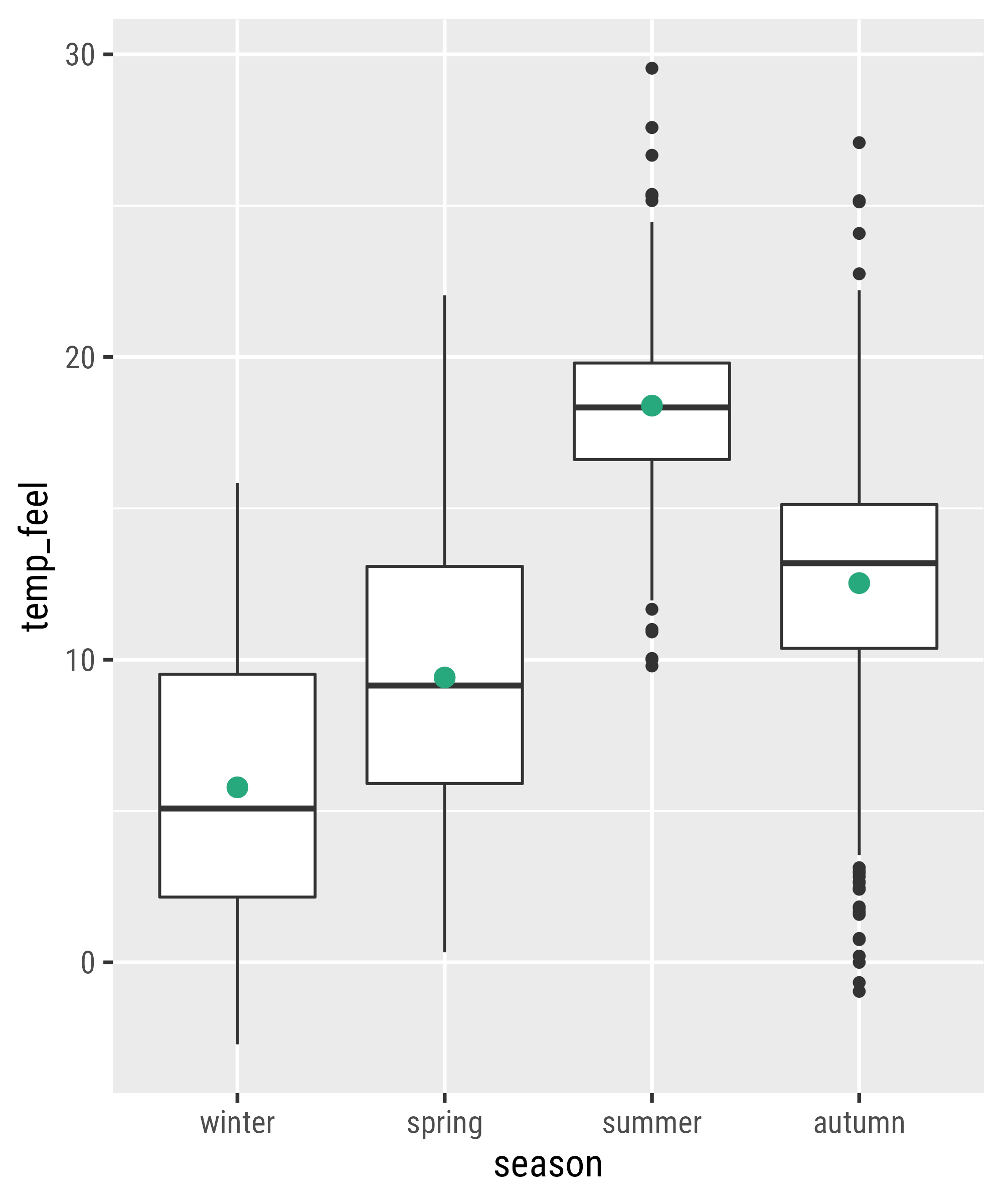
Statistical Summaries
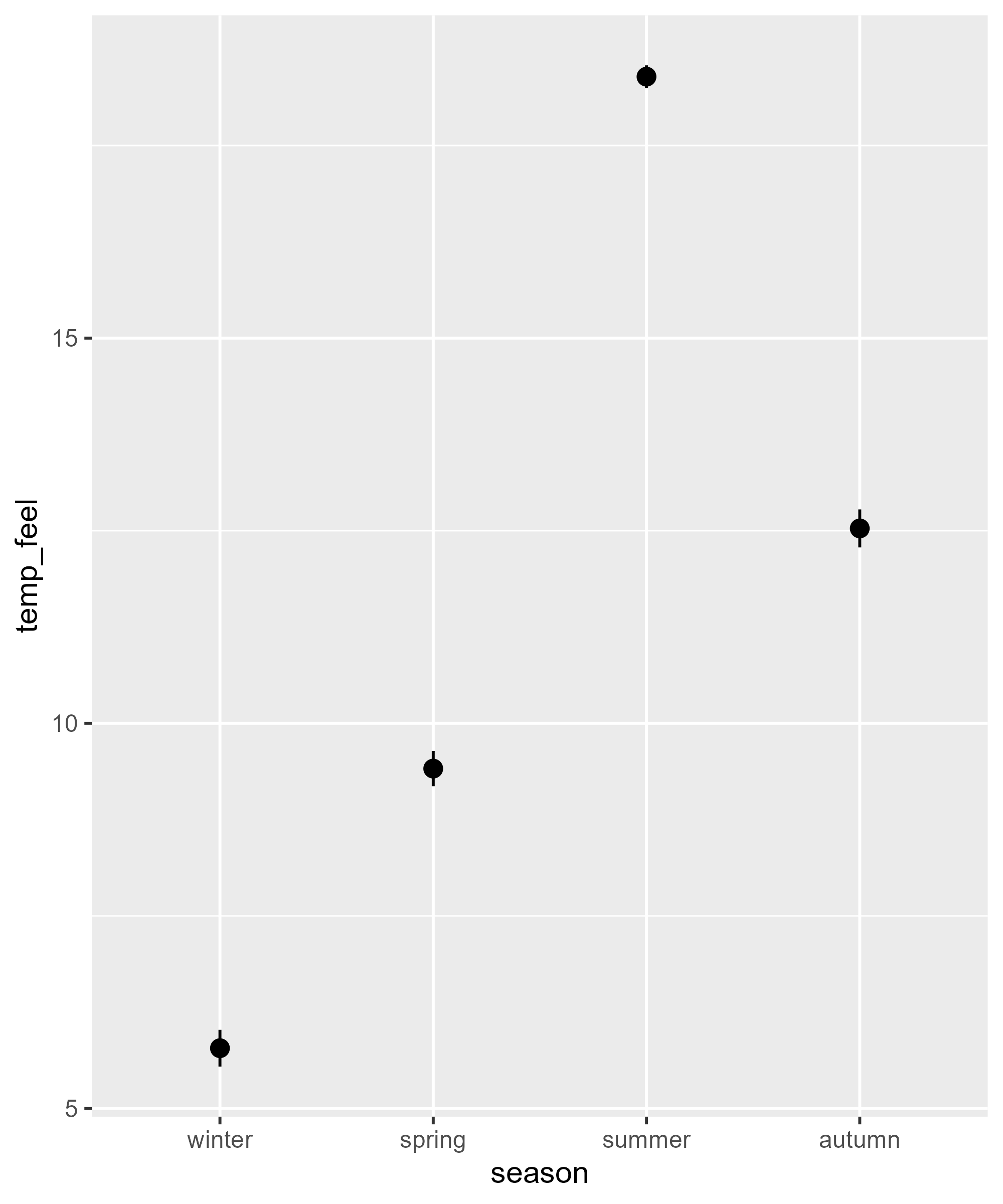
Extend a ggplot Object: Add Layers
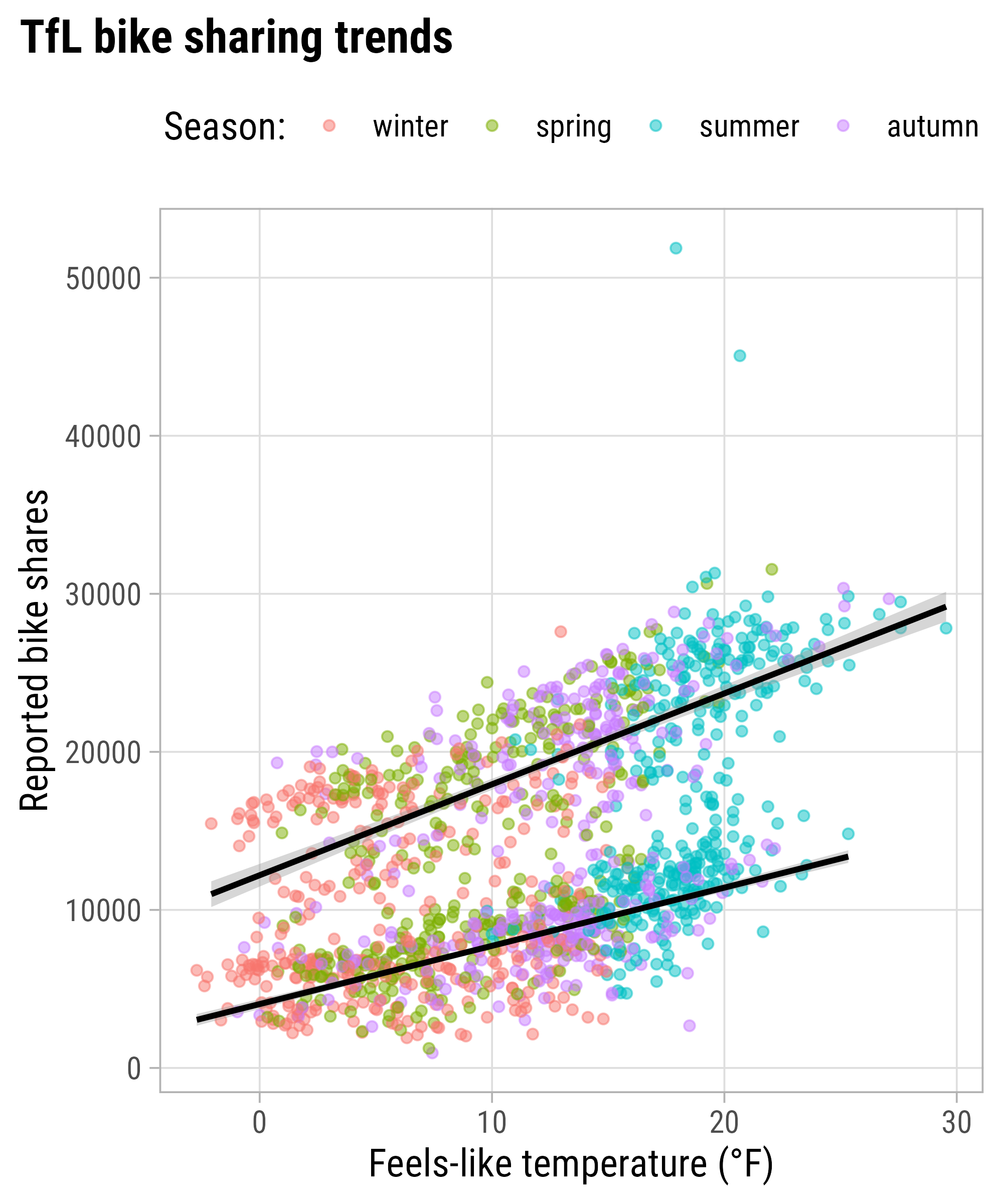
Remove a Layer from the Legend

Extend a ggplot Object: Add Labels

Extend a ggplot Object: Add Labels
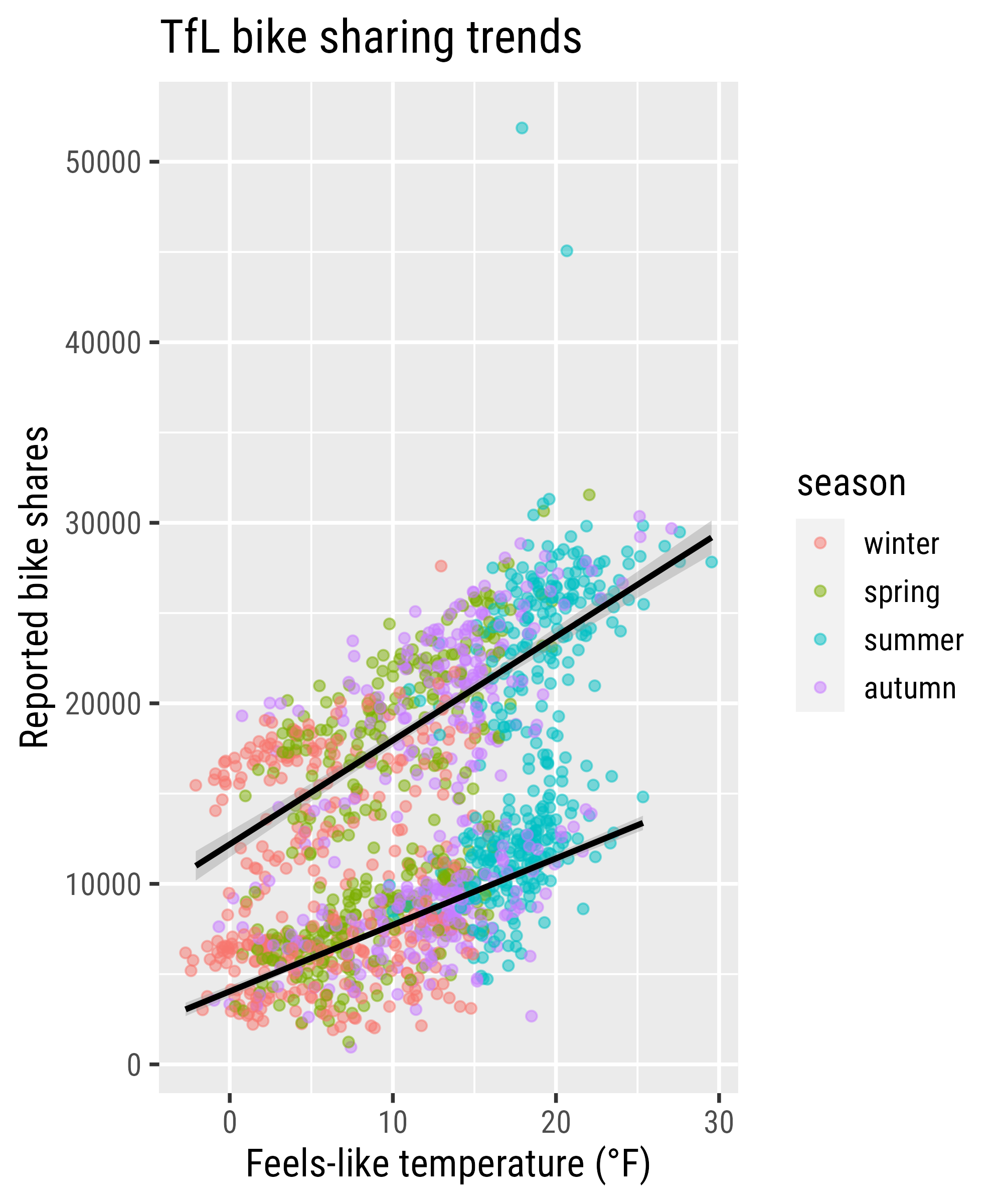
Extend a ggplot Object: Add Labels

Extend a ggplot Object: Add Labels
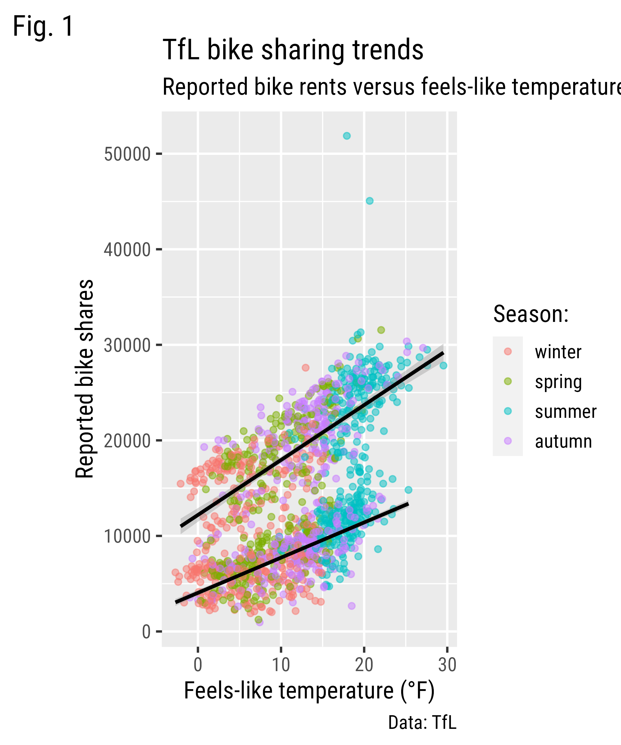
Extend a ggplot Object: Add Labels
Extend a ggplot Object: Themes

Change the Theme Base Settings
Set a Theme Globally
Change the Theme Base Settings

{systemfonts} + {ggplot2}
Overwrite Specific Theme Settings

Overwrite Specific Theme Settings

Overwrite Specific Theme Settings
Overwrite Specific Theme Settings
Overwrite Specific Theme Settings

Overwrite Theme Settings Globally

Modified from canva.com
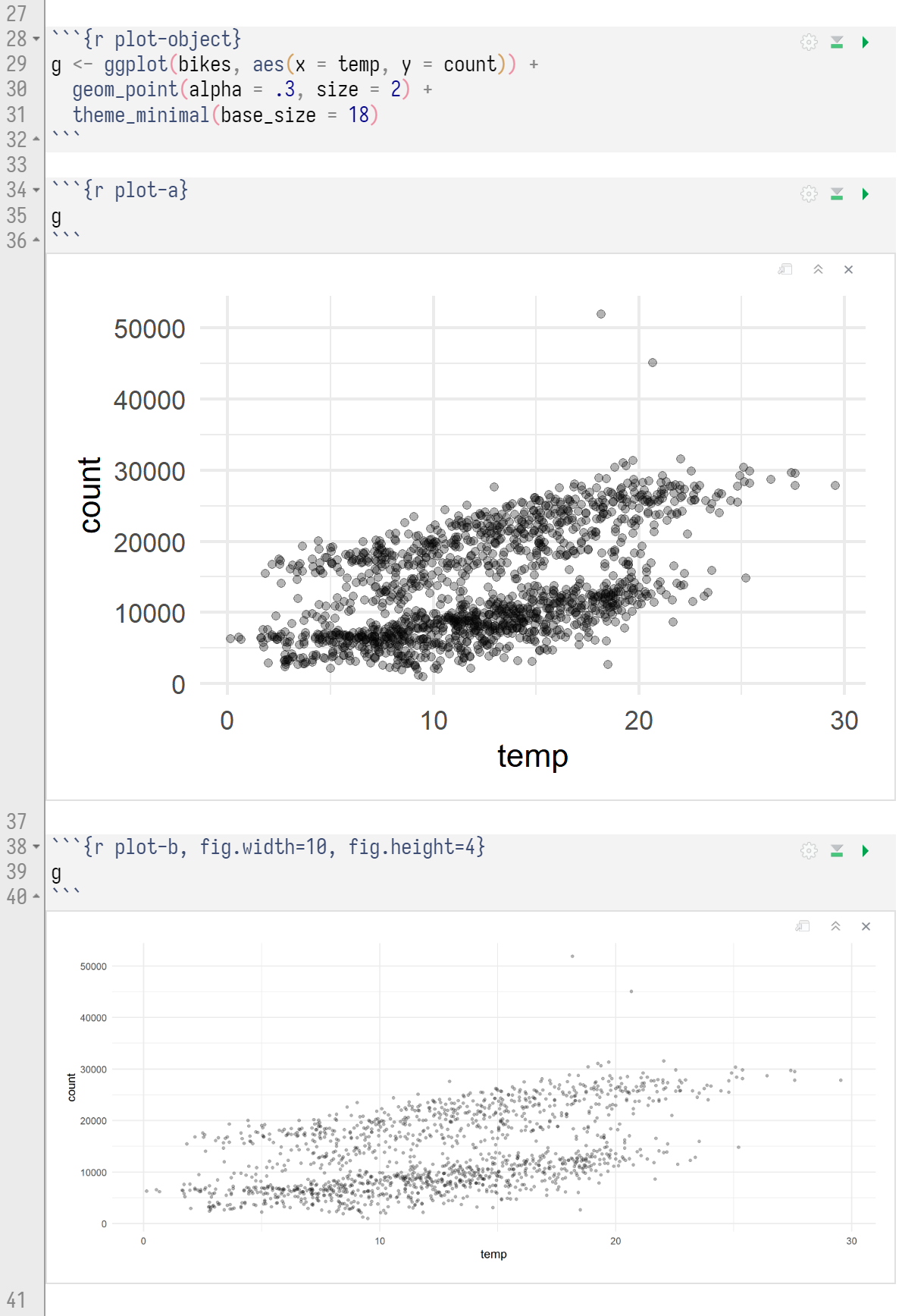
Setting Plot Sizes in Rmd’s
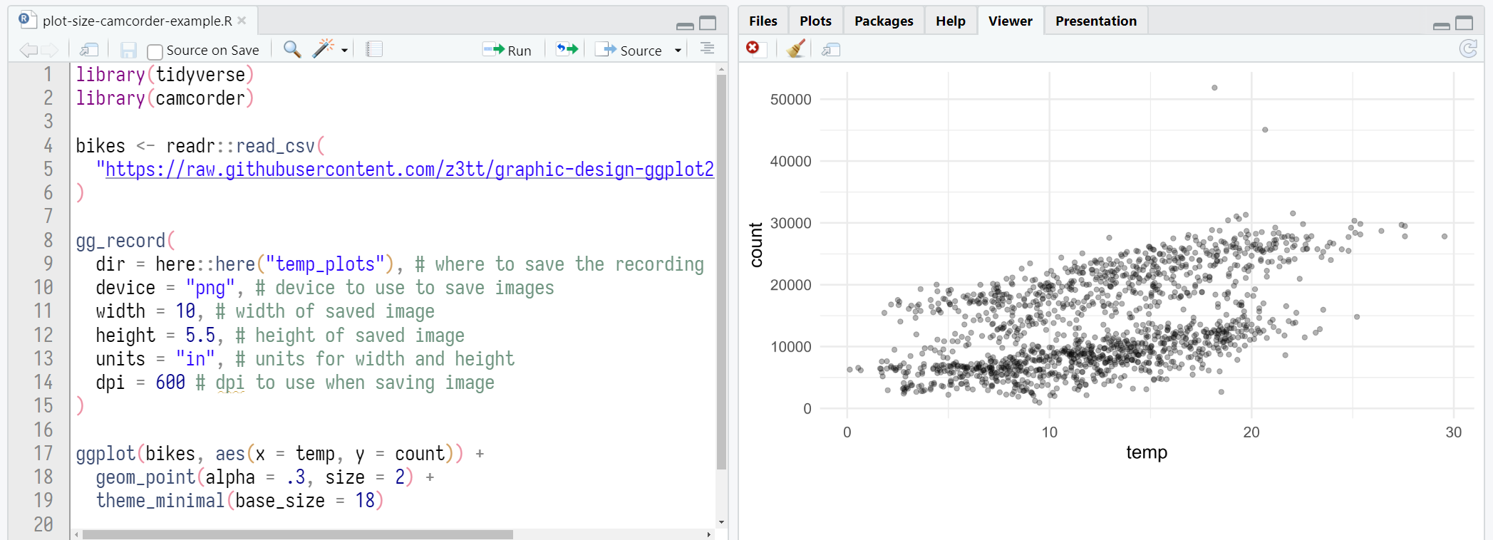
Setting Plot Sizes via {camcorder}