Graphic Design with ggplot2

Group Projects

Cédric Scherer // rstudio::conf // July 2022

Group Projects

  • Form groups and work on one of the following suggested projects:
    • Carbon Footprint of Travel (OWID / UK.gov)
    • Spendings COVID Pandemic (JP Morgan Chase)
    • Speed of Languages (Economist / Coupé et al.)
    • US Drought Patterns (Drought Monitor)
A very colorful bar chart by Our World in Data showing the carbon footrprint per passenger for differen types of mid- to long-distance transportation.

Graphic Source: Our World in Data

A line plot by the JP Morgan Chase institute showing timeseries for 10 different categories before and after the National Emergency in 2020.

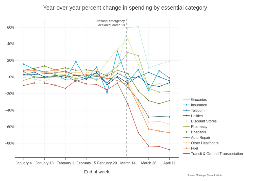
Graphic Source: JPMorgan Chase Institute

A area chart by The Economist showing the distriubtion of information and speech rates for different languages.

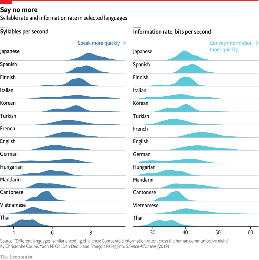
Graphic Source: The Economist