library(tidyverse)
data <- read_csv(here::here("data", "carbon-footprint-travel.csv"))
data %>%
mutate(
type = case_when(
str_detect(entity, "car|Motorcycle") ~ "Private motorized transport",
str_detect(entity, "flight") ~ "Public air transport",
str_detect(entity, "Ferry") ~ "Public water transport",
TRUE ~ "Public land transport"
)
) %>%
ggplot(
aes(x = emissions,
y = forcats::fct_reorder(entity, -emissions),
fill = type)
) +
geom_col(orientation = "y", width = .8) +
geom_text(
aes(label = paste0(emissions, "g")),
nudge_x = 5,
hjust = 0,
size = 5,
family = "Lato",
color = "grey40"
) +
scale_x_continuous(
breaks = seq(0, 250, by = 50),
labels = function(x) glue::glue("{x} g"),
expand = c(0, 0),
limits = c(0, 285)
) +
scale_fill_manual(
values = c("#dfb468", "#8fb9bf", "#28a87d"), name = NULL, guide = guide_legend(reverse = TRUE)
) +
labs(
x = NULL, y = NULL,
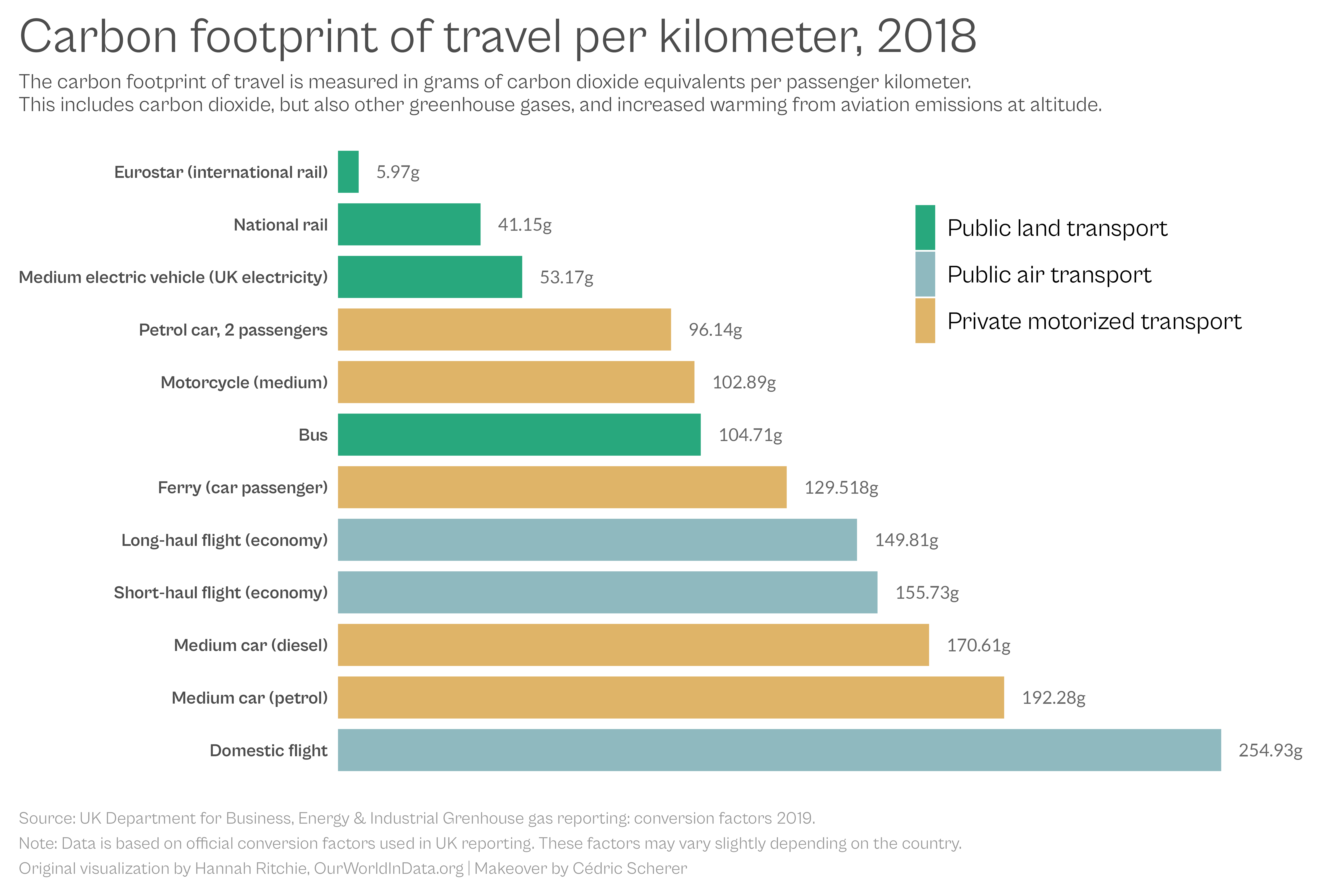
title = "Carbon footprint of travel per kilometer, 2018",
subtitle = "The carbon footprint of travel is measured in grams of carbon dioxide equivalents per passenger kilometer.\nThis includes carbon dioxide, but also other greenhouse gases, and increased warming from aviation emissions at altitude.",
caption = "Source: UK Department for Business, Energy & Industrial Grenhouse gas reporting: conversion factors 2019.\nNote: Data is based on official conversion factors used in UK reporting. These factors may vary slightly depending on the country.\nOriginal visualization by Hannah Ritchie, OurWorldInData.org | Makeover by Cédric Scherer"
) +
theme_minimal(base_size = 18, base_family = "Cabinet Grotesk") +
theme(
panel.grid.major = element_blank(),
panel.grid.minor = element_blank(),
axis.text = element_text(color = "grey30"),
axis.text.y = element_text(face = "bold"),
axis.text.x = element_blank(),
legend.position = c(.75, .8),
legend.text = element_text(size = 20),
legend.key.height = unit(2.6, "lines"),
plot.title = element_text(family = "Cabinet Grotesk", size = 40, color = "grey30", margin = margin(b = 10)),
plot.subtitle = element_text(size = 17, color = "grey30", margin = margin(b = 20)),
plot.title.position = "plot",
plot.caption = element_text(size = 14, hjust = 0, color = "grey60", margin = margin(t = 20), lineheight = 1.2),
plot.caption.position = "plot",
plot.margin = margin(15, 15, 15, 15)
)
ggsave("emissions.png", width = 15, height = 10)Graphic Design with ggplot2
Group Projects:
“Solutions”
Cédric Scherer // rstudio::conf // July 2022
Group Projects
- Form groups and work one of the following suggested projects:
- Carbon Footprint of Travel (OWID / UK.gov)
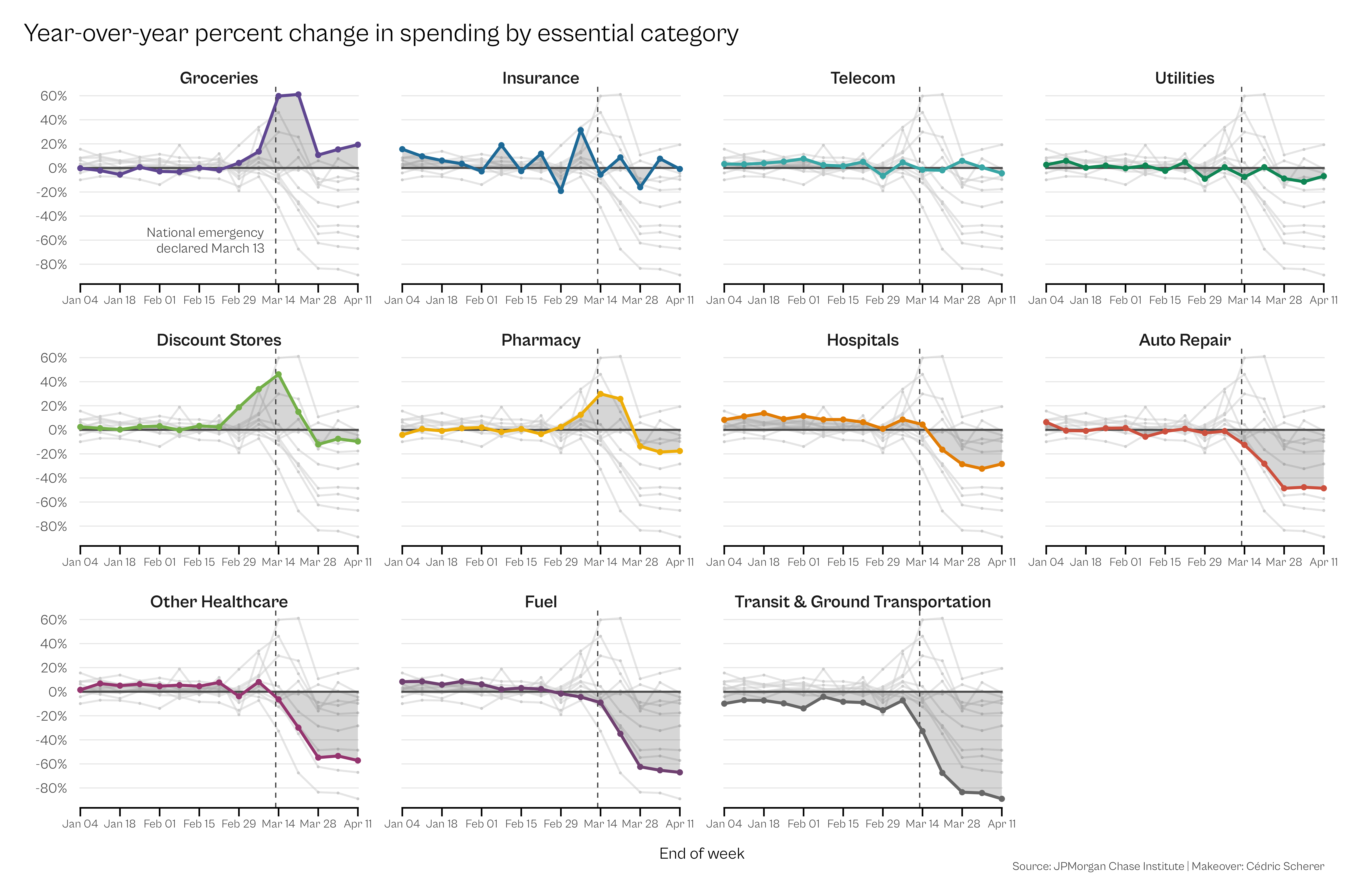
- Spendings COVID Pandemic (JP Morgan Chase)
- Speed of Languages (Economist / Coupé et al.)
- US Drought Patterns (Drought Monitor)
Carbon Footprint of Travel

Graphic Source: Our World in Data
Spendings COVID Pandemic
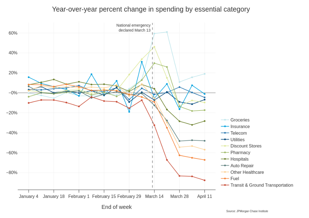
Graphic Source: JPMorgan Chase Institute
library(tidyverse)
library(gghighlight)
library(lubridate)

invisible(Sys.setlocale("LC_TIME", "C"))

data <- read_csv(here::here("data", "spending-jpmorgan.csv")) %>%
  mutate(category = fct_inorder(category))

label_df <-
  tibble(
    date = ymd("2020-03-13"),
    change = -60,
    label = "National emergency\ndeclared March 13",
    category = factor("Groceries", levels = levels(data$category))
  )

ggplot(data, aes(date, change, color = category)) +
    geom_point() +
    geom_line(size = .8, alpha = .5) +
    gghighlight(
      use_direct_label = FALSE,
      unhighlighted_params = list(color = "grey80", size = .5)
    ) +
    geom_vline(xintercept = ymd("2020-03-13"), color = "grey25", linetype = "dashed") +
    geom_hline(yintercept = 0, color = "grey30", size = .8) +
    geom_area(alpha = .2) +
    geom_line(size = 1.2) +
    geom_point(size = 1.8) +
    geom_text(
      data = label_df,
      aes(label = label),
      color = "grey25",
      family = "Cabinet Grotesk",
      size = 4.1,
      lineheight = .95,
      hjust = 1.1
    ) +
    facet_wrap(~ category, ncol = 4, scales = "free_x") +
    coord_cartesian(clip = "off") +
    scale_x_date(
      expand = c(.003, .003),
      breaks = seq(ymd("2020-01-04"), ymd("2020-04-11"), length.out = 8),
      date_labels = "%b %d"
    ) +
    scale_y_continuous(
      breaks = seq(-80, 60, by = 20),
      labels = glue::glue("{seq(-80, 60, by = 20)}%")
    ) +
    rcartocolor::scale_color_carto_d(
      palette = "Prism", guide = "none"
    ) +
    labs(
      x = "End of week", y = NULL,
      title = "Year-over-year percent change in spending by essential category",
      caption = "Source: JPMorgan Chase Institute | Makeover: Cédric Scherer"
    ) +
    theme_minimal(
      base_family = "Cabinet Grotesk", base_size = 14
    ) +
    theme(
      plot.title = element_text(size = 22, margin = margin(b = 20)),
      plot.title.position = "plot",
      plot.caption = element_text(color = "grey25", size = 10, margin = margin(t = 0)),
      plot.caption.position = "plot",
      axis.text.x = element_text(size = 10),
      axis.text.y = element_text(size = 12, margin = margin(l = 10, r = 7)),
      axis.title.x = element_text(margin = margin(t = 15)),
      axis.line.x = element_line(),
      axis.ticks.x = element_line(color = "black"),
      axis.ticks.length.x = unit(.5, "lines"),
      strip.text = element_text(size = 15, face = "bold", margin = margin(b = 0)),
      panel.grid.major.y = element_line(color = "grey90", size = .4),
      panel.grid.major.x = element_blank(),
      panel.grid.minor = element_blank(),
      panel.spacing.x = unit(2.5, "lines"),
      panel.spacing.y = unit(1.5, "lines"),
      plot.margin = margin(20, 35, 20, 20)
    )
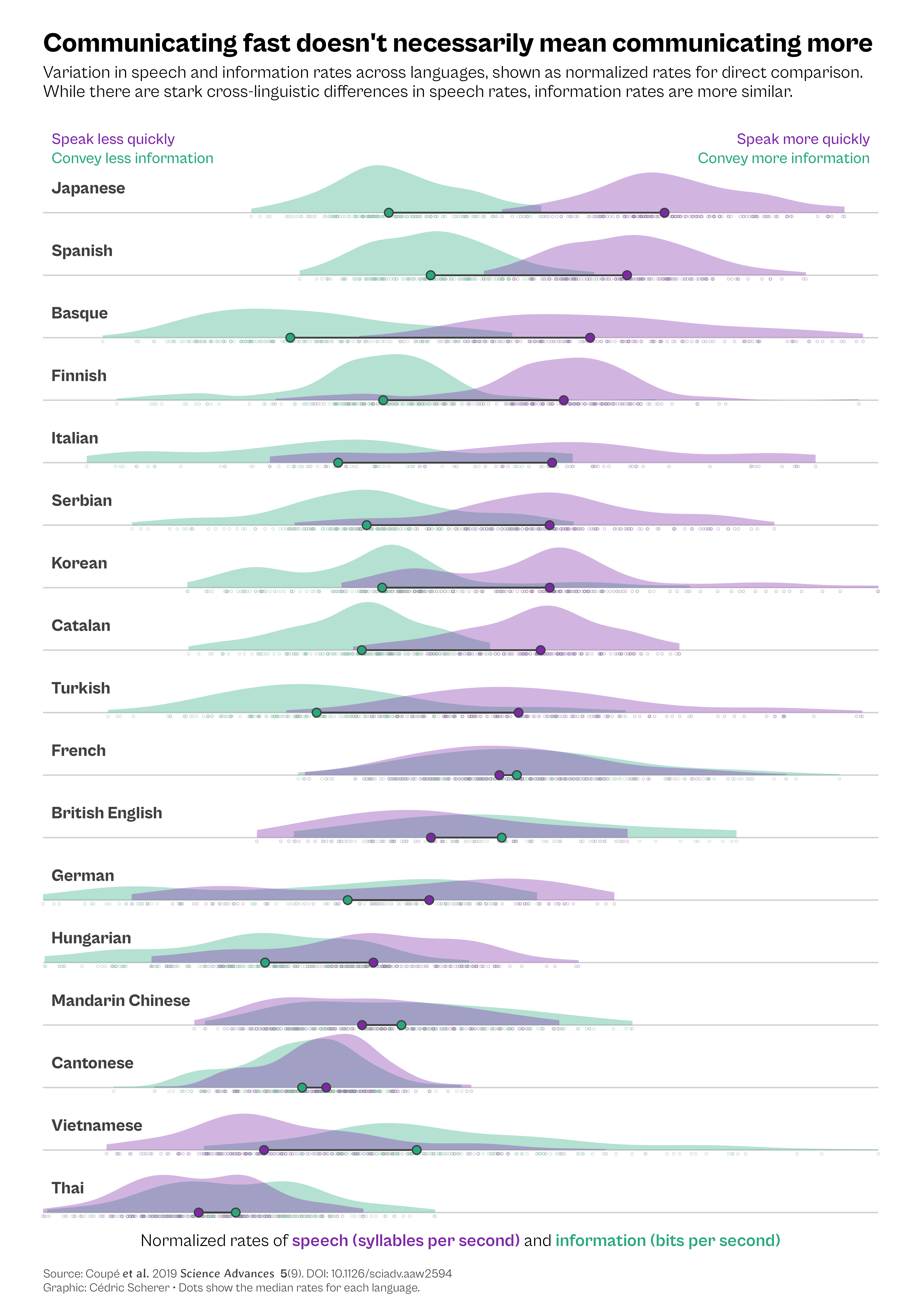
Speed of Languages
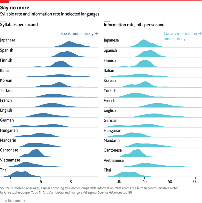
Graphic Source: The Economist
library(tidyverse)
library(ggtext)
library(colorspace)

data <-
  read_csv(here::here("data", "information-speech.csv")) %>%
  group_by(language) %>%
  mutate(
    avg_sr = mean(speech_rate),
    avg_ir = mean(info_rate)
  ) %>%
  ungroup() %>%
  mutate(
    language = fct_reorder(language, avg_sr),
    language_long = fct_reorder(language_long, avg_sr)
  )

systemfonts::register_variant(
  name = "Cabinet Grotesk ExtraBold",
  family = "Cabinet Grotesk",
  weight = "ultrabold"
)

systemfonts::register_variant(
  name = "Cabinet Grotesk Medium",
  family = "Cabinet Grotesk",
  weight = "medium"
)

data_long <-
  data %>%
  dplyr::select(starts_with("lang"), speech_rate, info_rate) %>%
  ## normalize
  mutate(
    speech_rate = (speech_rate - min(speech_rate)) / (max(speech_rate) - min(speech_rate)),
    info_rate = (info_rate - min(info_rate)) / (max(info_rate) - min(info_rate))
  ) %>%
  group_by(language) %>%
  mutate(
    avg_sr = median(speech_rate),
    avg_ir = median(info_rate)
  ) %>%
  ungroup() %>%
  pivot_longer(
    cols = c(speech_rate, info_rate),
    names_to = "metric",
    values_to = "rate"
  ) %>%
  mutate(metric = factor(metric, levels = c("speech_rate", "info_rate")))

data_labs <-
  data.frame(
    language_long = factor("Japanese", levels = levels(data_long$language_long)),
    label = c("Speak less quickly", "Convey less information", "Speak more quickly", "Convey more information"),
    metric = factor(c("speech_rate", "info_rate", "speech_rate", "info_rate"), levels = levels(data_long$metric)),
    rate = c(.01, .01, .99, .99),
    vjust = c(-6.5, -4.7, -6.5, -4.7),
    hjust = c(0, 0, 1, 1)
  )

ggplot(data_long, aes(x = rate, y = language_long)) +
  ## rain dots
  geom_point(
    aes(color = metric, color = after_scale(desaturate(lighten(color, .2), .4))),
    position = position_nudge(y = -.06), shape = 1, size = .8, alpha = .35
  ) +
  ## distribution
  ggdist::stat_halfeye(
    aes(color = metric, fill = after_scale(color)),
    slab_alpha = .35, .width = 0, trim = TRUE, shape = 21, point_colour = "grey25", stroke = 1.6, scale = .86
  ) +
  ## median line
  geom_linerange(
    aes(xmin = avg_sr, xmax = avg_ir),
    size = .7, color = "grey25", stat = "unique"
  ) +
  ## median points
  ggdist::stat_halfeye(
    aes(color = metric), .width = c(0), slab_fill = NA
  ) +
  ## language labels
  geom_text(
    aes(label = language_long, x = .01),
    position = position_nudge(y = .4), stat = "unique", hjust = 0,
    family = "Cabinet Grotesk ExtraBold", color = "grey25", size = 5.5
  ) +
  geom_text(
    data = data_labs, aes(label = label, color = metric, vjust = vjust, hjust = hjust),
    family = "Cabinet Grotesk Medium", size = 5
  ) +
  coord_cartesian(xlim = c(0, 1), clip = "off") +
  scale_x_continuous(
    expand = c(0, 0), breaks = 0:5 / 5, guide = "none"
  ) +
  scale_y_discrete(
    expand = c(.01, .01)
  ) +
  scale_color_manual(
    values = c("#7d28a8", "#28a87d"), guide = "none"
  ) +
  labs(
    x = "Normalized rates of <b style='color:#7d28a8;'>speech (syllables per second)</b> and <b style='color:#28a87d;'>information (bits per second)</b>",
    y = NULL,
    title = "Communicating fast doesn't necessarily mean communicating more",
    subtitle = "Variation in speech and information rates across languages, shown as normalized rates for direct comparison.\nWhile there are stark cross-linguistic differences in speech rates, information rates are more similar.",
    caption = "Source: Coupé *et al.* 2019 *Science Advances* **5**(9). DOI: 10.1126/sciadv.aaw2594<br>Graphic: Cédric Scherer  •  Dots show the median rates for each language."
  ) +
  theme_minimal(base_size = 16, base_family = "Cabinet Grotesk") +
  theme(
    panel.grid.minor = element_blank(),
    panel.grid.major.x = element_blank(),
    panel.grid.major.y = element_line(size = .6, color = "grey82"),
    axis.line.x = element_line(color = "black", size = .6),
    axis.ticks.x = element_line(color = "black", size = .6),
    axis.ticks.length.x = unit(.5, "lines"),
    axis.title.x = element_markdown(margin = margin(t = 10)),
    axis.title.x.top = element_markdown(),
    axis.text.x = element_text(family = "Tabular", size = 14, color = "grey25"),
    axis.text.y = element_blank(),
    legend.position = "top",
    plot.margin = margin(30, 35, 20, 35),
    plot.title = element_text(family = "Cabinet Grotesk ExtraBold", size = 25),
    plot.subtitle = element_text(margin = margin(b = 45)),
    plot.caption = element_markdown(hjust = 0, margin = margin(t = 18), color = "grey25", lineheight = 1.15, size = 11)
  )
Cédric Scherer // rstudio::conf // July 2022